Good dashboad design matters. Here are 10 dashboarding tips to help you build better reports with improved data visualisation & data storytelling.
Learn how to annotate a mark that changes in Tableau. Read our latest blog here.
Learn how to design dashboards for mobile devices. Discover key tips, and techniques for optimizing dashboard layouts and interactions on mobile devices.
Learn how to apply conditional formatting to tooltips in Tableau with our step-by-step guide. Improve your data visualization skills today with Biztory.
Learn how to stop marks from being highlighted when clicked in Tableau. Read the full guide here.
Learn how to map your data to any background in Tableau. Read the full article with step-by-step instructions here.
Utilise our Sales Cloud Accelerator efficiently by reading this blog. Understand where to find it, how to connect to your data and how best to operate it
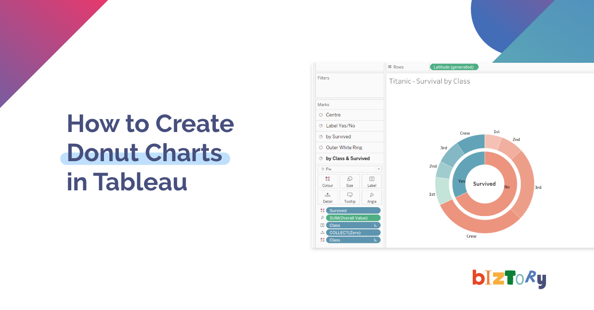
Looking to create a donut chart in Tableau? Read our in-depth guide on how to level up your donut charts in Tableau here.
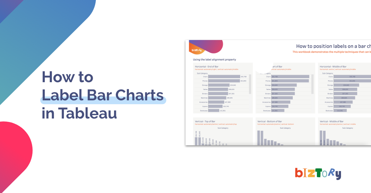
Learn how to label bar charts in Tableau like a pro and level up your dashboard design. Read the full article here.
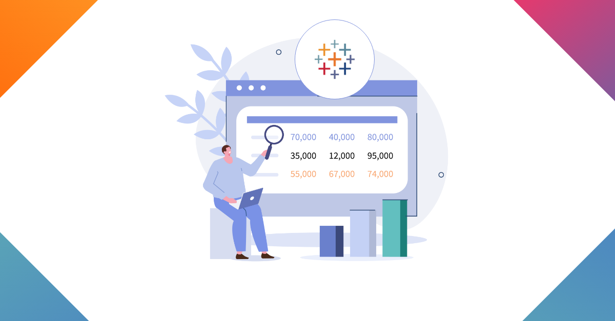
Learn how to quickly and easily get the accurate business data you need to make effective decisions and report on your department's performance.
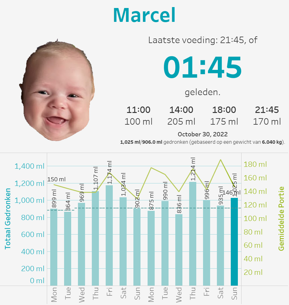
A different take on an alternative dashboarding and data viz project, that may inspire you to do something unique in the future!
Follow this tutorial and learn how to create an interactive calendar in Tableau Desktop. Read more here.