

.avif)

Learn how to apply conditional formatting to tooltips in Tableau
A key strength of Tableau is interactivity; the ability to click or hover on marks on a viz and see some response eg another viz being filtered or a detailed list of information being displayed.
One key piece of basic functionality that helps in this is the tooltip. Click or hover on a mark on a chart and by default all the information for the fields on the canvas related to that mark will display in a text box.
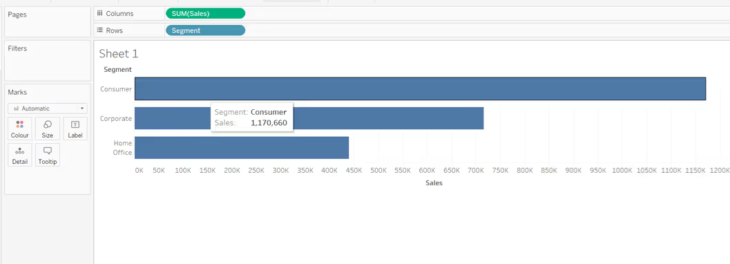
Tableau Tooltip basics
When building dashboards for wider consumption, it is always good practice to ensure these tooltips are given some love. At the least, that is to check there aren’t any spurious fields displayed that are required for the viz, but not relevant to a reader.
For example in the image below, a fake axis (MIN(1)) has been used to help display some KPIs. By default the MIN(1) value is listed in the tooltip.

Alternatively, it could be that the whole tooltip is superfluous and essentially just repeating the information already displayed - in which case they can be turned off (from the Tooltip shelf uncheck the Show Tooltips box).
However, more often than not, you will want to utilise the tooltip to show the exact values related to the mark along with some extra supplementary information - the “detail on demand”.
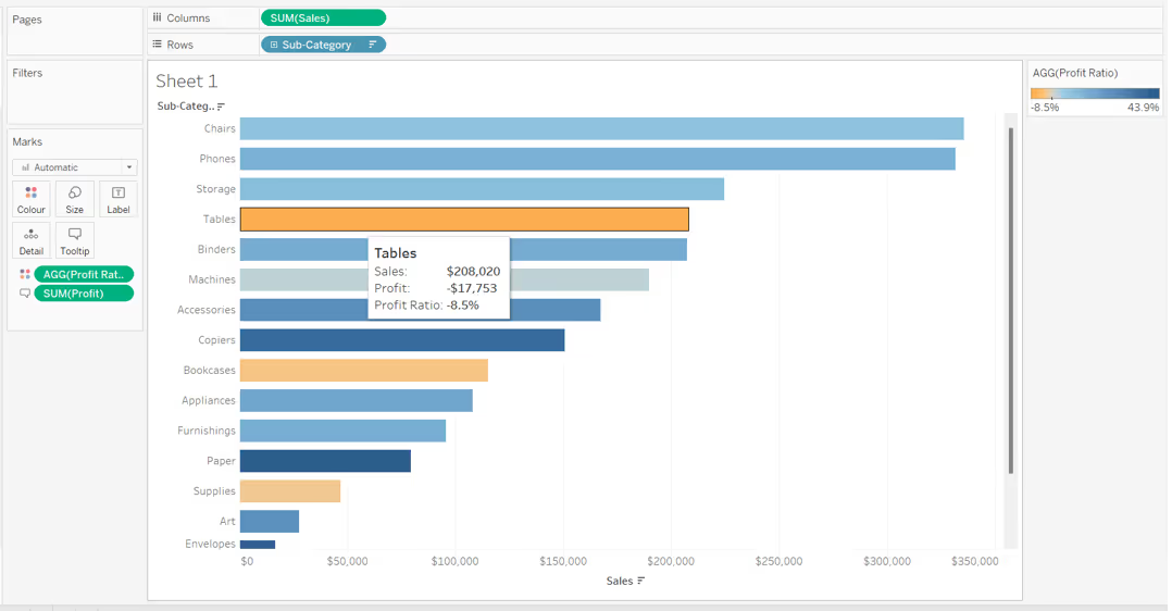
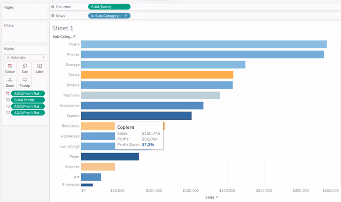
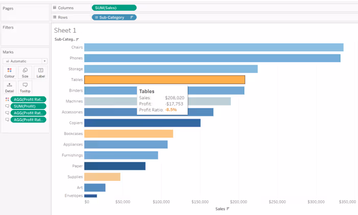
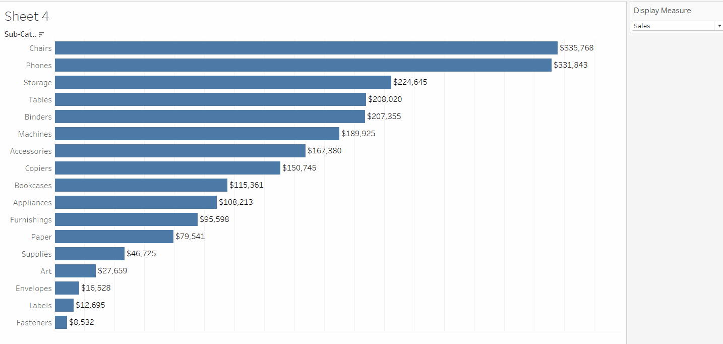
In the image below, the viz is displaying Sales by Sub-Category, and coloured by Profit Ratio. The tooltip shows the exact values for both the Sales and Profit Ratio along with the value for Profit too.
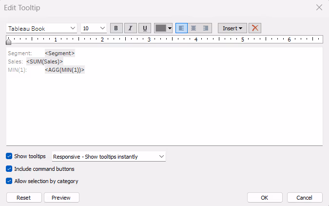
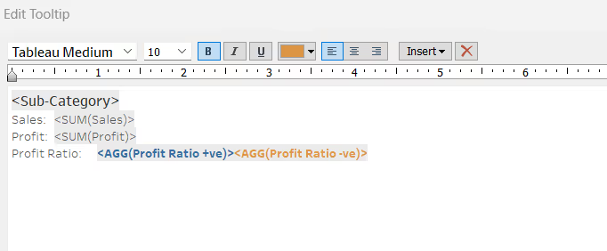
Some basic formatting has been applied just using the text editor features available in the Edit Tooltip dialog box.
The text editor feature allows simple formatting of the font only - the font type, style, size, colour and alignment can all be changed, and can vary.
For example, if you choose, fields can be a different colour or style (bold, italic etc) from the rest of the text, but by default, the formatting you apply is always the same regardless of the actual value of the field.
There is no functionality within the text editor to define logic against the field and so format differently based on the condition.
Conditional Formatting in Tableau
To apply conditional formatting into a tooltip, you need to create additional calculated fields. A field needs to exist for each outcome of whatever logic/condition you want to apply alternative formatting too.
The best way to explain is to work through some examples.
Colour the Profit Ratio value based on whether it is Positive or Negative
Continuing from the example above, we want to display the value of the Profit Ratio on the tooltip in orange if it is negative and blue if it is positive, to align with the colour range displayed on the viz.
To do this, we create:
Profit Ratio +ve
IF [Profit Ratio]>=0 THEN [Profit Ratio] END
Format this to a % with 1 dp.
We also need:
Profit Ratio -ve
IF [Profit Ratio]<0 THEN [Profit Ratio] END
This also needs to be formatted to % with 1dp.
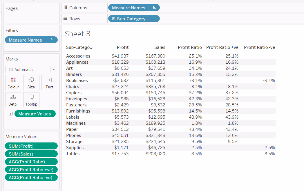
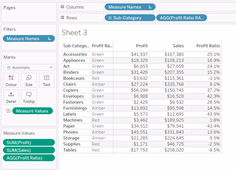
If we pop these fields into a tabular view with our existing Sales, Profit and Profit Ratio fields, we can see that when the Profit Ratio is negative, the Profit Ratio +ve column displays nothing, and when the Profit Ratio is positive, the Profit Ratio -ve column displays nothing.
There is never an occasion when both the Profit Ratio +ve and the Profit Ratio -ve fields contain a value.
We can add both these fields onto the Tooltip shelf of the viz, and edit the tooltip so the Profit Ratio +ve and Profit Ratio -ve fields are displayed directly side by side. Each field can then be coloured based on our requirements.
As only one of the fields can ever contain a value at one time, then only one Profit Ratio value will display on the tooltip, and it will be coloured according to its value.
Colour a RAG Status Indicator
It’s quite common for businesses to have thresholds defining the health of key values. These thresholds equate to a RAG status against each value.
For example, suppose the Profit Ratio is considered healthy (green) if it is above 15%, a concern (amber) if it is between 5%-15% and an issue (red) if less than 5%.
We might have a calculation as follows
Profit Ratio RAG Status
IF [Profit Ratio] >= 0.15 THEN 'Green'
ELSEIF [Profit Ratio] >=0.05 THEN 'Amber'
ELSE 'Red'
END
In our tabular view, this displays as below
On the tooltip, rather than display the words Red, Amber, Green, we want to display a coloured indicator. For this we need calculated fields again.
Profit Ratio - Red
IF [Profit Ratio] < 0.05 THEN '◆' END
The ◆ is a unicode character that you can just copy from a web page and paste into the text. This is a useful reference site for finding characters : https://jrgraphix.net/r/Unicode/25A0-25FF
Similarly we can create
Profit Ratio - Amber
IF [Profit Ratio] >= 0.05 AND [Profit Ratio] < 0.15 THEN '▲' END
and
Profit Ratio - Green
IF [Profit Ratio] >= 0.15 THEN '●' END
All three fields can then be added to the Tooltip shelf of the viz, positioned side by side and coloured accordingly.
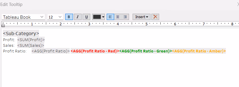
Which results in a tooltip display like below:

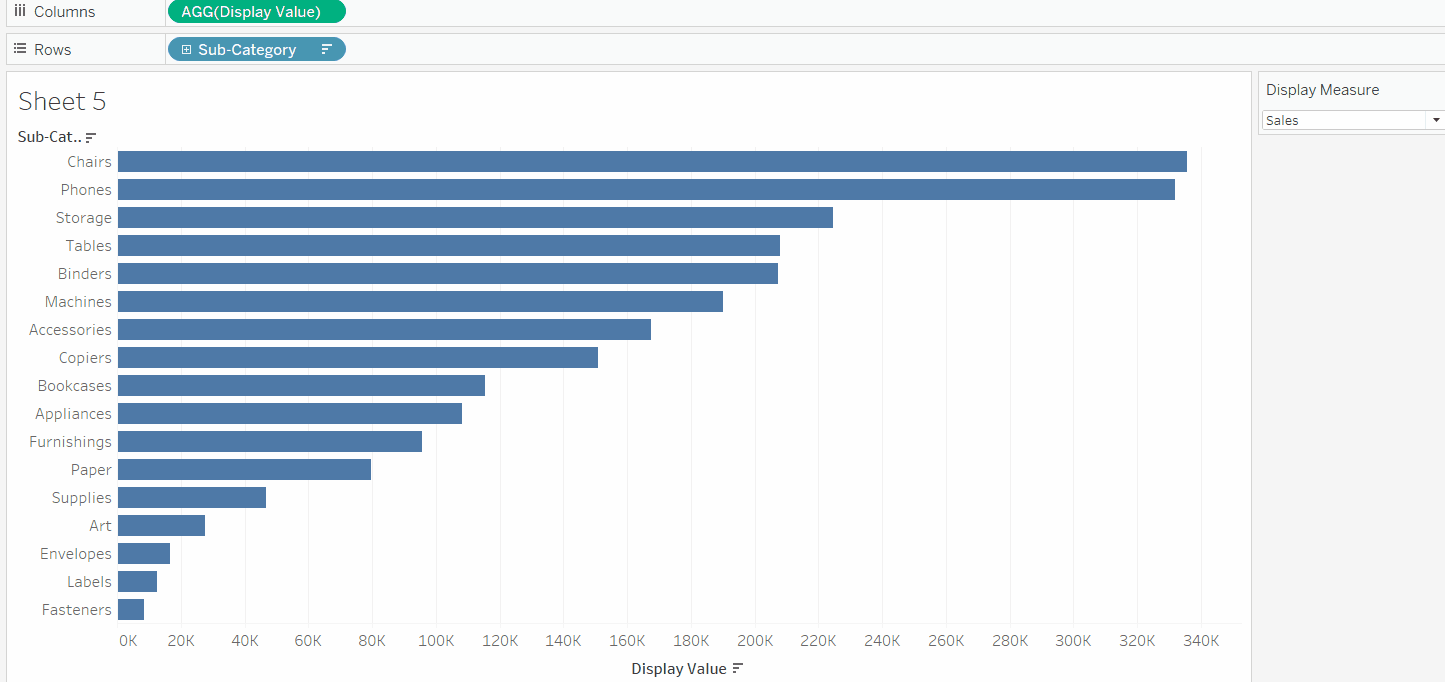
Applying a Number Format to a value which can contain different units of value
In the example below, we are using a parameter to change the measure to be displayed in the Viz.
While Sales and Profit both have the same unit of measure ($), Profit Ratio is displayed as a percentage (%), and we can display the values correctly formatted on both the labels and in the tooltip, using the same techniques described above.
To build this type of ‘measure swap’ chart, you need a parameter which lists the different measures you want to display, and a calculated field which determines which measure to actually show based on the parameter.
Display Measure
A string parameter listing the different options available for selection

Display Value
CASE [Display Measure]
WHEN 'Sales' THEN SUM([Sales])
WHEN 'Profit' THEN SUM([Profit])
WHEN 'Profit Ratio' THEN [Profit Ratio]
END
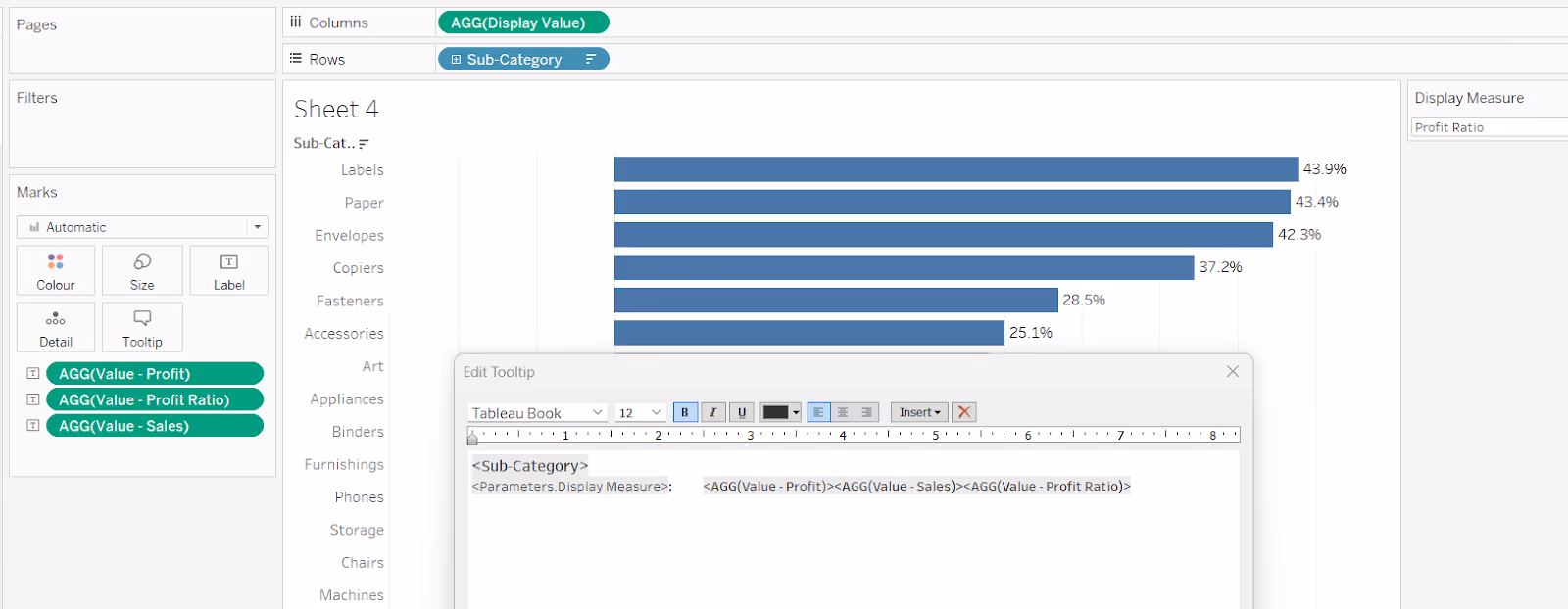
The Display Value is then plotted against another dimension (in this case Sub-Category), but the values on the axis and the tooltip change as the parameter is changed.
The Display Value can’t be formatted as it can’t be both a monetary value ($) and a percentage (%).
To resolve this, we need calculated fields, one per measure to be displayed.
Note - we can’t just use the existing fields for Sales, Profit or Profit Ratio as these will always contain values regardless of the option selected from the parameter, and we don’t want all three values to display.
So we need
Value - Sales
IF [Display Measure] = 'Sales' THEN SUM([Sales]) END
Format this field to $ with 0 dp.
Value - Profit
IF [Display Measure] = 'Profit' THEN SUM([Profit]) END
Format this field to $ with 0 dp.
Value - Profit Ratio
IF [Display Measure] = 'Profit Ratio' THEN [Profit Ratio] END
Format this to % with 1 dp.
Add all 3 fields to the Label shelf, positioning each field directly adjacent to each other, and then also adjust the Tooltip in a similar way.
You can reference the parameter in the tooltip too, so the value is correctly labelled.
Summary
Hopefully these examples give you some ideas of the way you can apply conditional formatting to your tooltips in Tableau, and also show how this can be extended to labels too.
Depending on your requirements and complexity of your condition, it could mean several additional calculated fields need to be built, so it is always worth considering whether the benefit outweighs the development and potential future maintenance effort.
A workbook to accompany this blog post containing some of the examples discussed, can be accessed from here.


