.avif)

Learn how to label pie charts in Tableau like a pro
Want to learn more about labeling your pie charts in Tableau? Don't worry. This blog aims to provide you with in-depth step-by-step instructions on how to label pie charts in Tableau like a pro.
Let's get started!
Labeling pie charts in Tableau
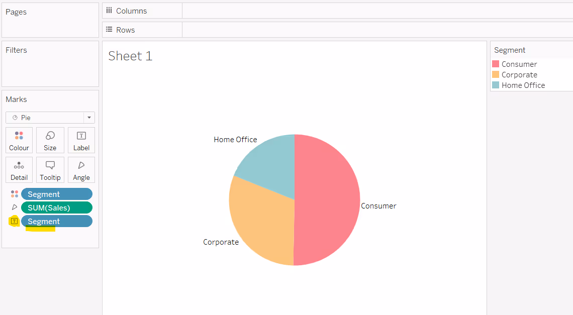
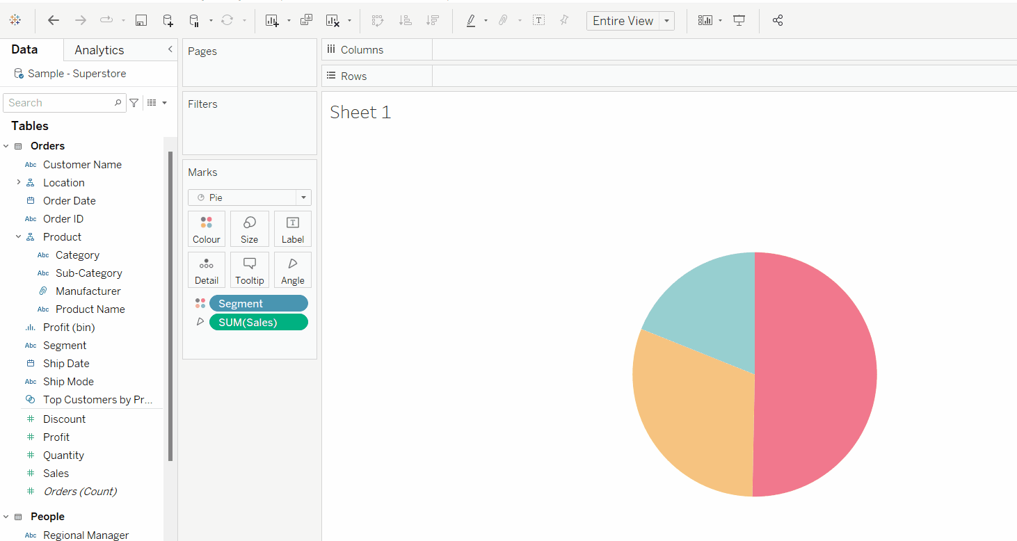
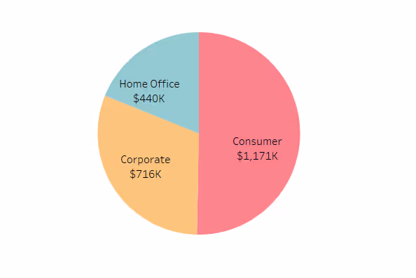
When building a pie chart in Tableau, the default behaviour when choosing to show mark labels is for the label to be displayed outside of the pie.
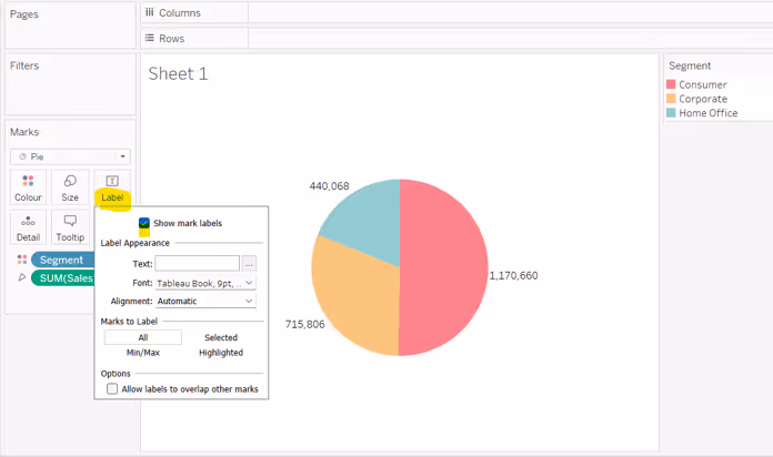
Additional fields can be added to the Label shelf if required, for example if you don’t want to display a separate colour legend, you’d typically add the field the data is split by onto the label instead.
Or you may choose to combine to display additional information.
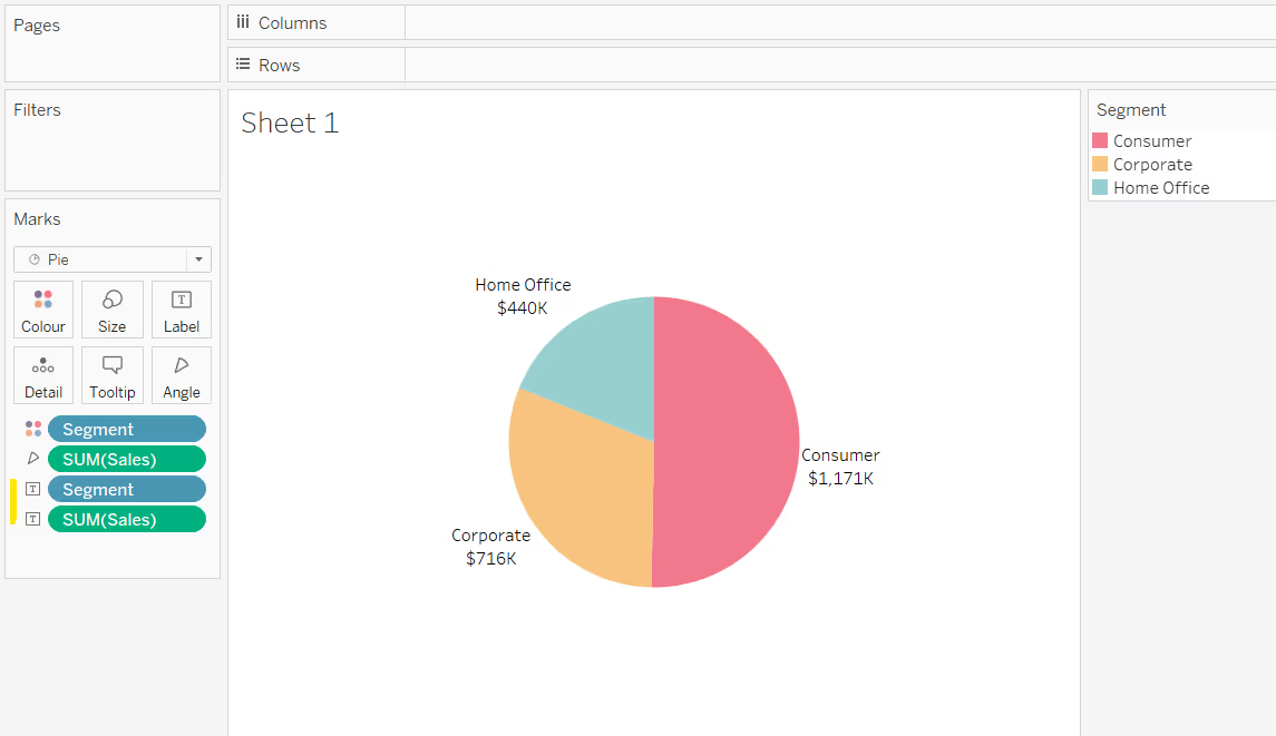
Tableau will position the label based on where it computes ‘is best’ given the number and the size of the different slices and how the slices are sorted.
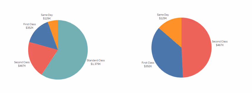
For example, the pie chart below has been split by Ship Mode which has 4 values. The image on the left is sorted based on the default sort order (alphabetical), whilst the one on the right is sorted based on the volume of sales.

Manually repositioning labels
As with all labels, it is possible to manually move them; just click on the text of the label you want to move, and when the cursor changes to a cross, you can drag the label to reposition it.

However, you should only do this if the data you are presenting is static and won’t change (unless you are changing the workbook too, and can review how the data is displayed), and the data can’t be interacted with by the user.
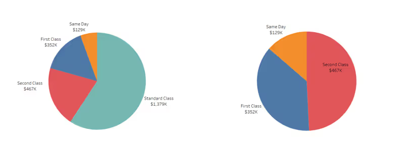
For example, the image below shows a pie chart with the labels positioned where Tableau put them. The left image shows the data split into 4 ship modes. The right image has been filtered to exclude the Standard Class option. The labels are all positioned in a sensible location.
In the left hand image below, the label for Second Class has been manually moved to be positioned slightly higher than it was. Excluding the Standard Class option, now displays the label for Second Class in an unexpected position.
Displaying pie chart labels with line pointers

In order to display labels on your pie chart with pointers or arrows, you will need to use annotations.
Right click on a section of the pie chart and select Annotate > Mark Label
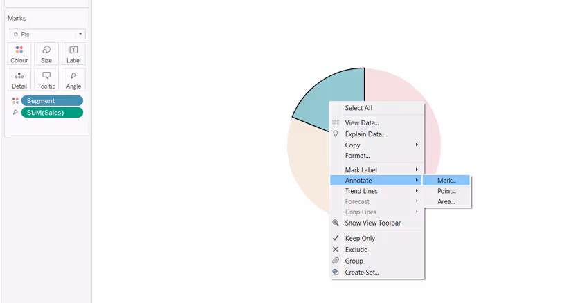
An Edit Annotation dialog box will display. By default it will contain information relating to all the fields on the current canvas of the worksheet - in this instance Segment and Sales.
If you want to label with something else, add the field onto the Detail shelf, and it can then be referenced in the dialog box. Adjust the text of the annotation as required.
Click on the annotation and manually move it to your desired position. Readjust the alignment of the text if required. Then right click on the annotation to format. In this instance the background shading has been reduced to 0%, and the line pointer has been made darker and thicker.
Adjust the size of the annotation box as required.
You then need to repeat this process for each of the sections on the pie chart you want to label.
Unfortunately, since this involves manually moving the annotations into a preferred position, the same issues can arise as discussed in the manually repositioning labels section above, so this isn’t a recommended solution if working with data that can change or be interacted with by the user.
Labelling inside a pie chart
You can create the appearance of labels inside a pie chart by using a dual axis technique.
Having built your basic pie chart, double click into the Rows and type MIN(0) to generate an axis.
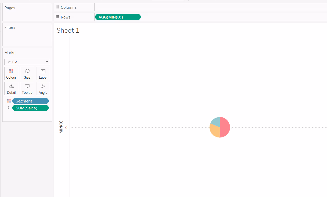
Double click into Rows again, and type another instance of MIN(0). You’ll now have two pie charts and two axes. Add the fields you want to use as labels to the Label shelf of the second MIN(0) marks card, and if they don’t automatically display, check the show mark labels option on the label shelf.
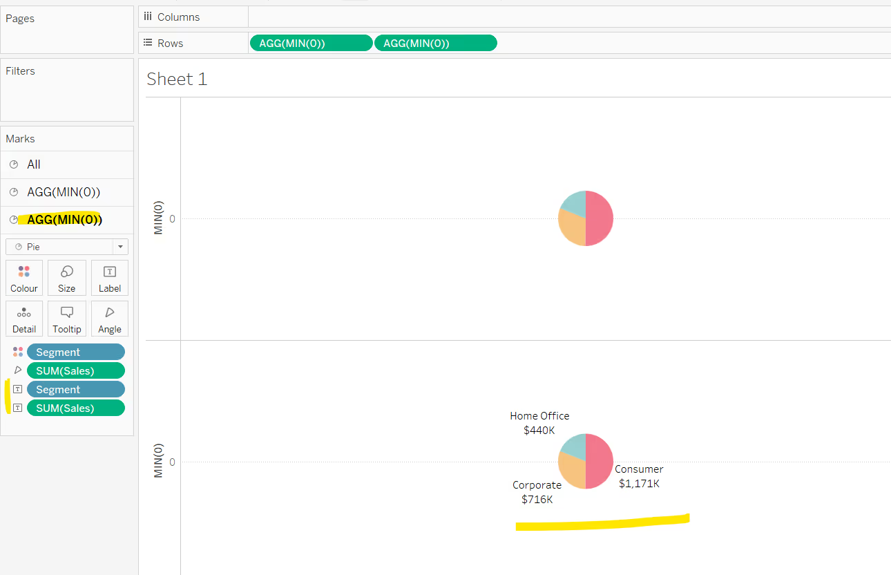
Make the chart dual axis and synchronise the axis. Remove Measure Names from the All Marks card, as it automatically gets added at the point we made the dual axis.
Then adjust the Size of the first MIN(0) marks card, so the pie chart without the labels is bigger. You may need to adjust the size of the labelled pie chart too.
(Note, if your pie charts aren’t sizing independently, make sure you don’t have any fields on the Size shelf - by default if you use the show me function to make a pie chart, it will add the measure eg Sales, to both the angle and the size property of the chart).
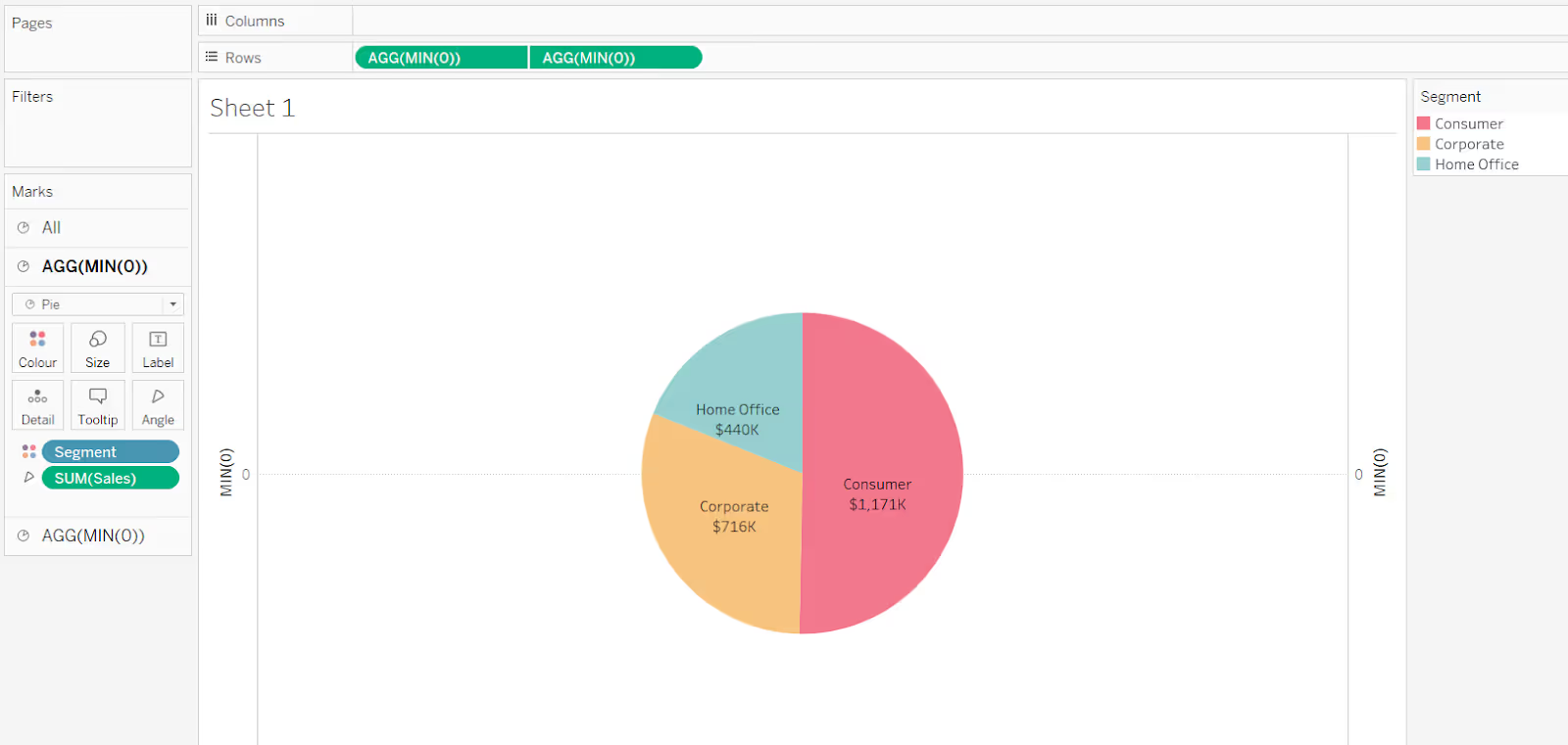
Finally remove all gridlines, zero lines, row & column dividers, and hide the axis (uncheck show header).
The issue with this technique is that the segments for the inner pie chart still show on hover or on click.

But there is another way to do this, which means this doesn’t happen.
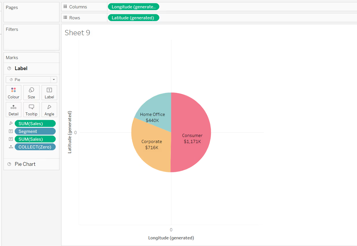
Labelling the inside of a pie chart with map layers
On the face of it, the pie itself doesn’t look any different from the dual axis method, but if you do have Tableau v2020.4 or greater, and you are building an interactive dashboard that allows users to hover and click on objects on the dashboard, then using map layers is probably the ‘cleaner’ solution.
Building the first map layer
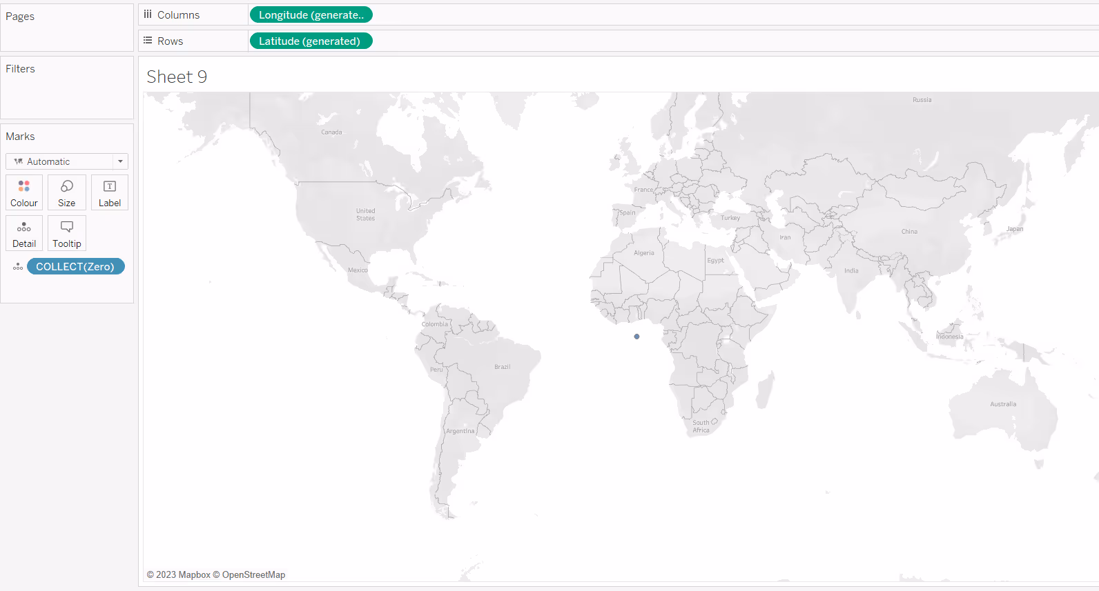
In order to use map layers, you must use a field with a geographic data type. As we’re not using one in this chart, we need to make one.
Create a new calculated field
Zero
MAKEPOINT(0,0)
Double click this field, and it will automatically add the point centrally onto a map with Longitude and Latitude fields automatically generated too.
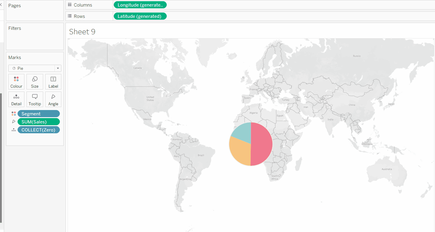
Add the field you want to ‘slice’ your pie with (in this case Segment) to Colour and adjust the colours. Change the mark type to pie chart and add your measure (in this case Sales) to angle. Increase the size to be as large as possible.
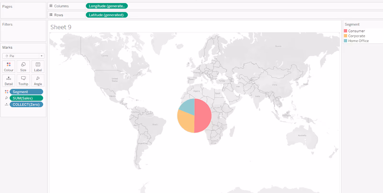
To increase the size beyond that possible with the slider on the Size shelf, use Ctrl-Shift-B (Windows) or Cmd-Shift-B (Mac) to increase the size further (Ctrl-B / Cmd-B to reduce).
Building the second map layer
Drag Zero onto the map canvas and drop it over the Add a Marks Layer section that displays. This will add a second marks card called Zero(2)
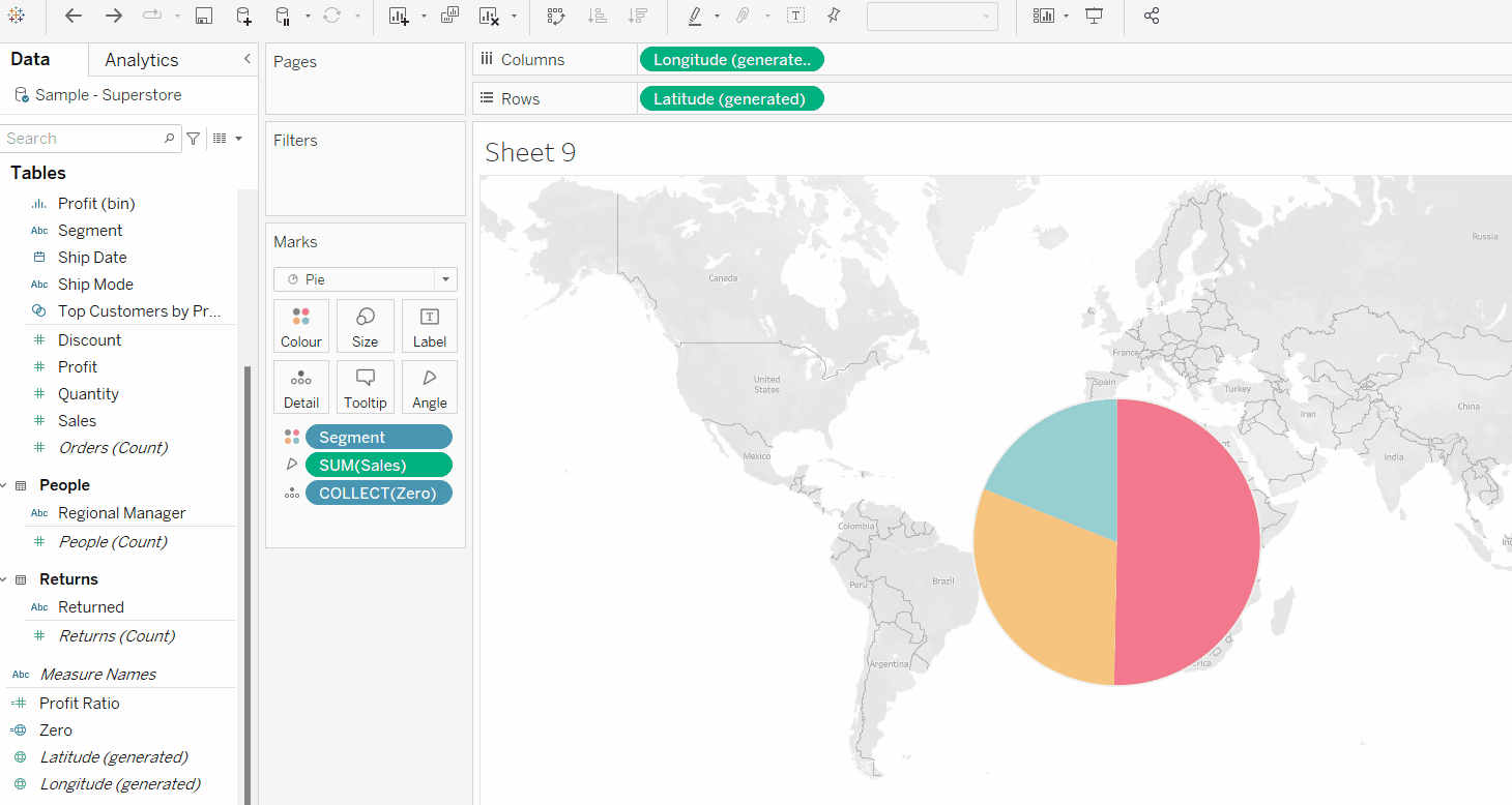
Rename the marks card labelled Zero to Pie Chart, and rename the marks card called Zero(2) to Label as this will make it easier to manage the layers (and these instructions).
Change the mark type of the Label marks card to pie chart. Add the same measure you used in the initial pie chart (ie Sales) to the angle shelf. Add the fields you want to use as a label to the Label shelf.
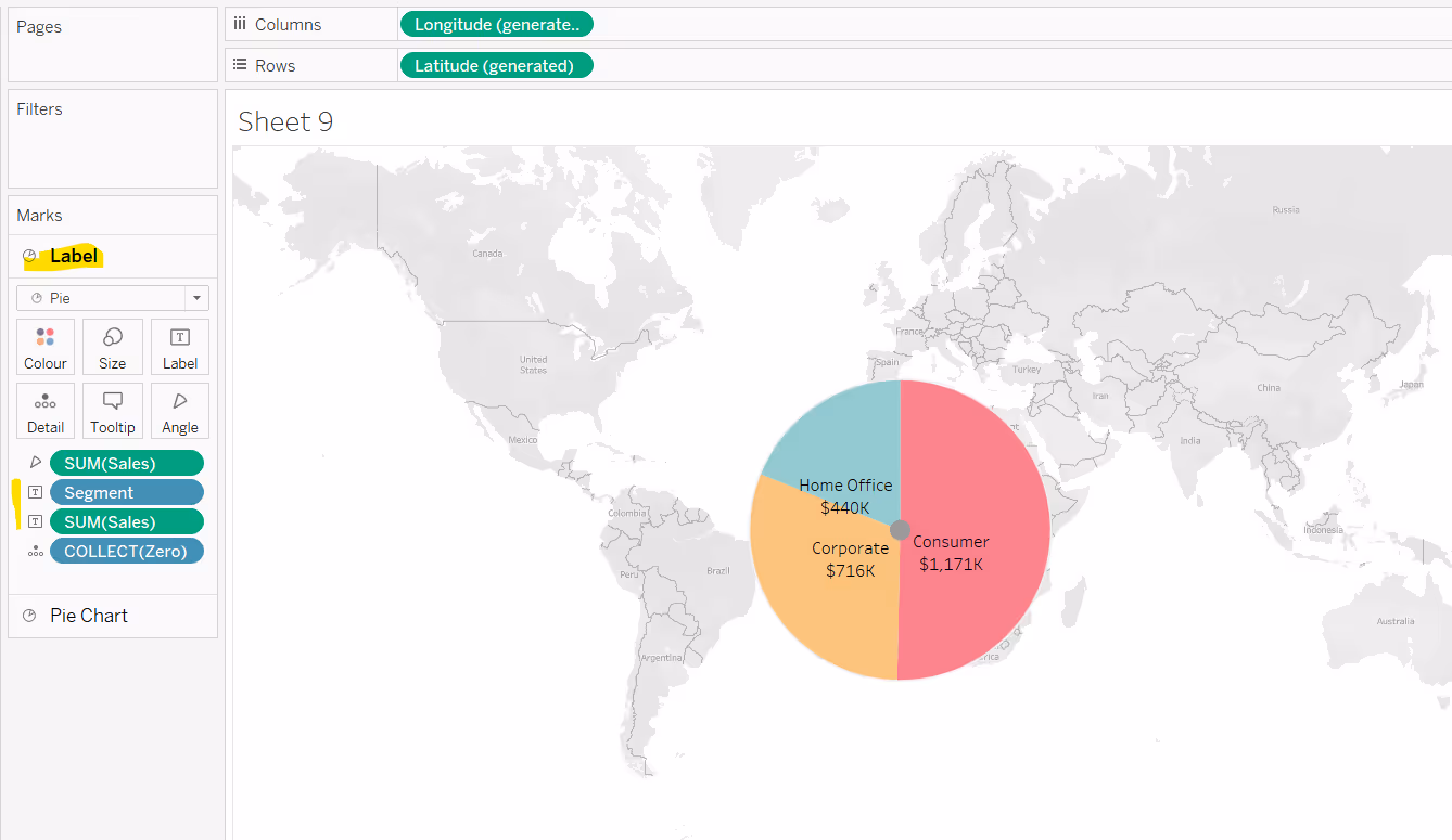
Adjust the size of the labelled pie chart to shift the labels so they are positioned as best as they can within the relevant slice of the outer pie.
Then prevent the inner circle / pie from being selected by clicking on the context menu next to the Label marks card name, and selecting disable selection.

If you click on the inner circle, it will now select the relevant area of the outer pie.
Then reduce the opacity of the Label pie chart to 0%, and the inner circle will disappear.
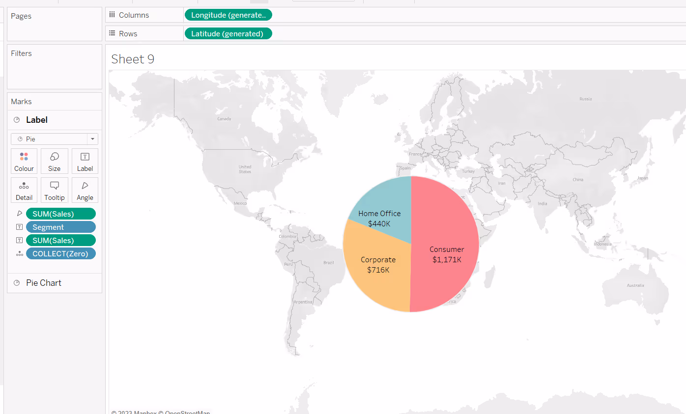
Finally remove the background map (from the Map menu, select Background Maps > None). This will result in the chart being displayed with traditional axes.
To finish, remove all gridlines, zero lines and axis rulers and hide the axes headers.
Extending the concepts
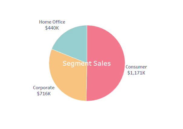
Once you’ve understood the different methods, you can then combine them to enhance how your visualisations are displayed.
In the image below, map layers have been used. The first map layer (the main pie chart) is labelled using the default labelling functionality. A second map layer is added which uses a circle mark type, which has been labelled with the text ‘Segment Sales’.
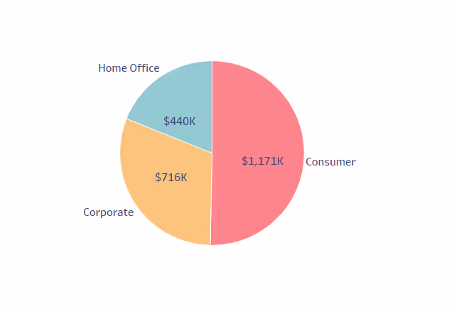
In this next example, map layers are again being used. The first map layer (the outer pie chart) is labelled with the segment name using the default labelling, while the second map layer (the inner pie chart) is labelled with the value.
Summary
Hopefully this blog has given you some ideas as to how you can position labels on a pie chart in different ways. However there is no foolproof way to get labels perfectly positioned without manual intervention, and doing that can add more issues as discussed above.
A workbook to accompany this blog post which features the examples discussed above, is accessible here.


.avif)


.avif)