

.avif)

One of the main features in Tableau is interactivity; the ability for a user to click on a chart or select specific marks to drive some sort of action, such as more information being displayed in a tooltip or another chart being filtered for example.
If something is interactive, you expect some sort of feedback to acknowledge the action you have taken. When you click on a mark in a chart on Tableau, the default behaviour is that the mark becomes selected or highlighted in comparison to the other marks; the other marks are ‘greyed out’ or appear faded.
However there are times when you don’t want this to happen; perhaps you want to indicate the selection chosen in some other way.
Using a dashboard filter action
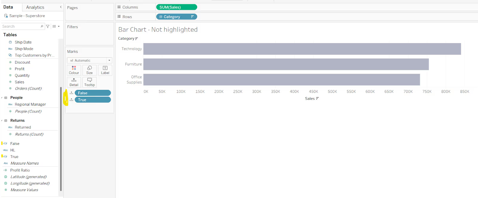
You can use a dashboard filter action to prevent the marks from being highlighted on selection. In the data pane, create two new calculated fields:
True
True
False
False
Add both of these onto the Detail shelf of the worksheet you want to control the highlighting for.
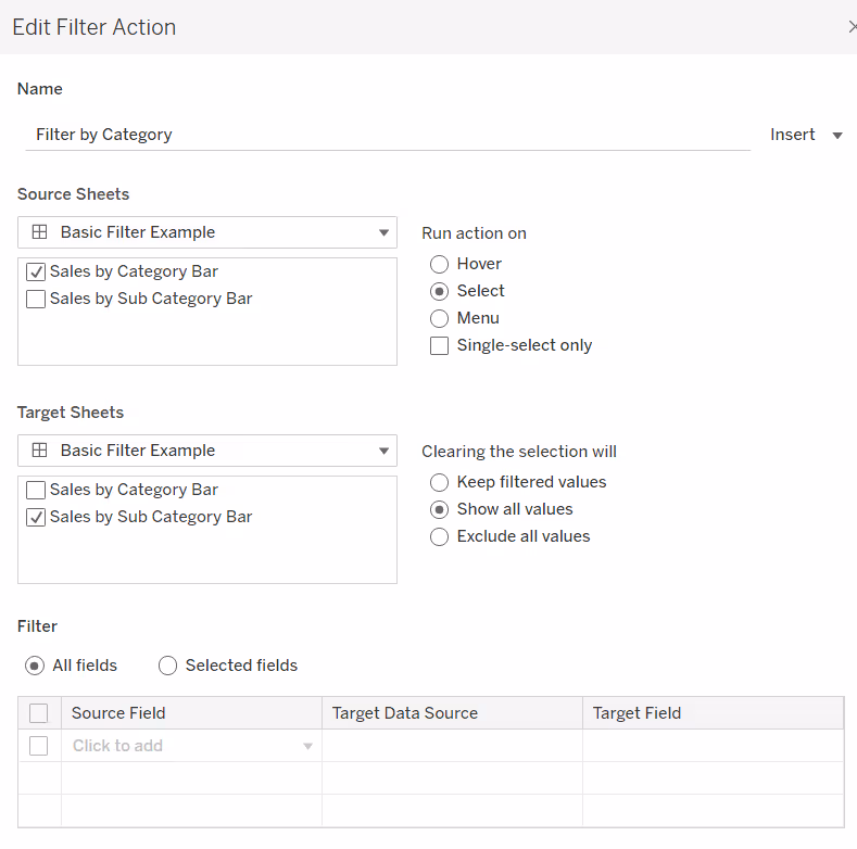
Add the worksheet to a dashboard, then add a dashboard filter action (Dashboard menu > Actions). In the Actions dialog box that displays, select Add Action and choose Filter.
In the Edit Filter Action dialog box, set the options as follows:
- Give the filter action an appropriate name
- Source sheets - select the dashboard and then the sheet on the dashboard you want to disable the highlighting for
- Set the action to run on select
- Target sheets - change this to explicitly point to the worksheet itself (ie not the sheet on the dashboard)
- Clearing the selection will show all values
- Filter by selected fields and select the fields from your data source True = False
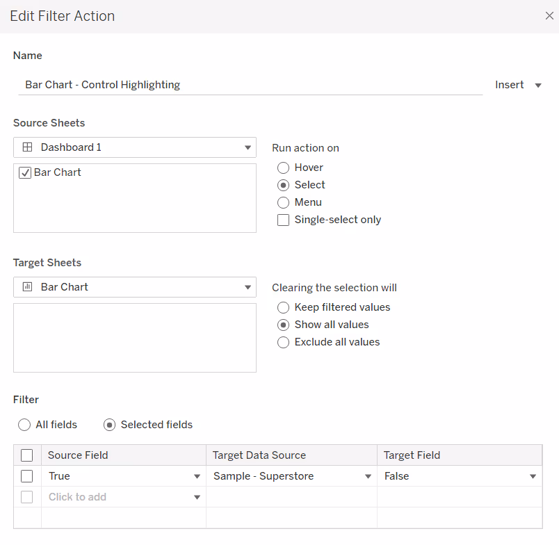
As the condition True = False can never be true, the worksheet doesn’t get filtered, so no selection happens (or rather a selection happens, which is immediately deselected).
Issues with this approach
Ultimately this is a workaround solution, utilising functionality in Tableau developed for one purpose, to solve a different problem. As a consequence, there are drawbacks.
If you want to apply this to multiple charts on the dashboard, you will need a separate dashboard filter action for each chart, as the target sheet in the dialog box needs to point to a specific worksheet, rather than a chart on a dashboard. You can utilise the same True/False fields on each worksheet though.
It also doesn’t always work well with other actions that may be applied to the dashboard, specifically other filter actions and set controls. You may find you need to apply other workarounds/techniques to resolve.
Deselect marks and retain other dashboard filtering
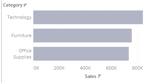
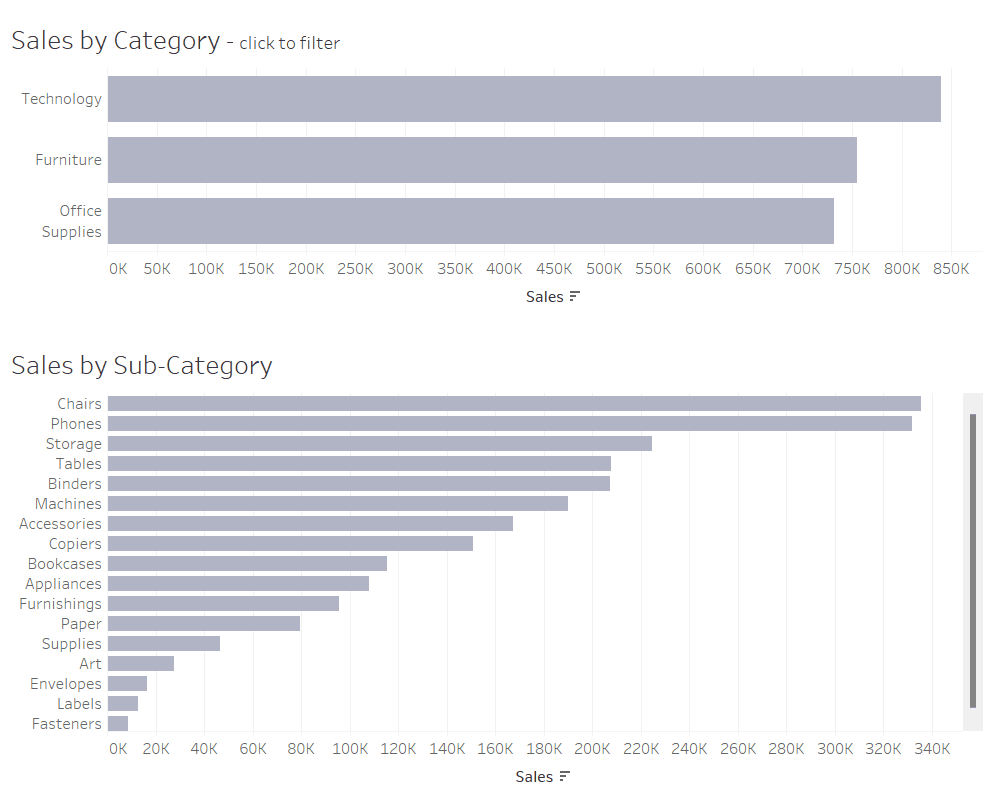
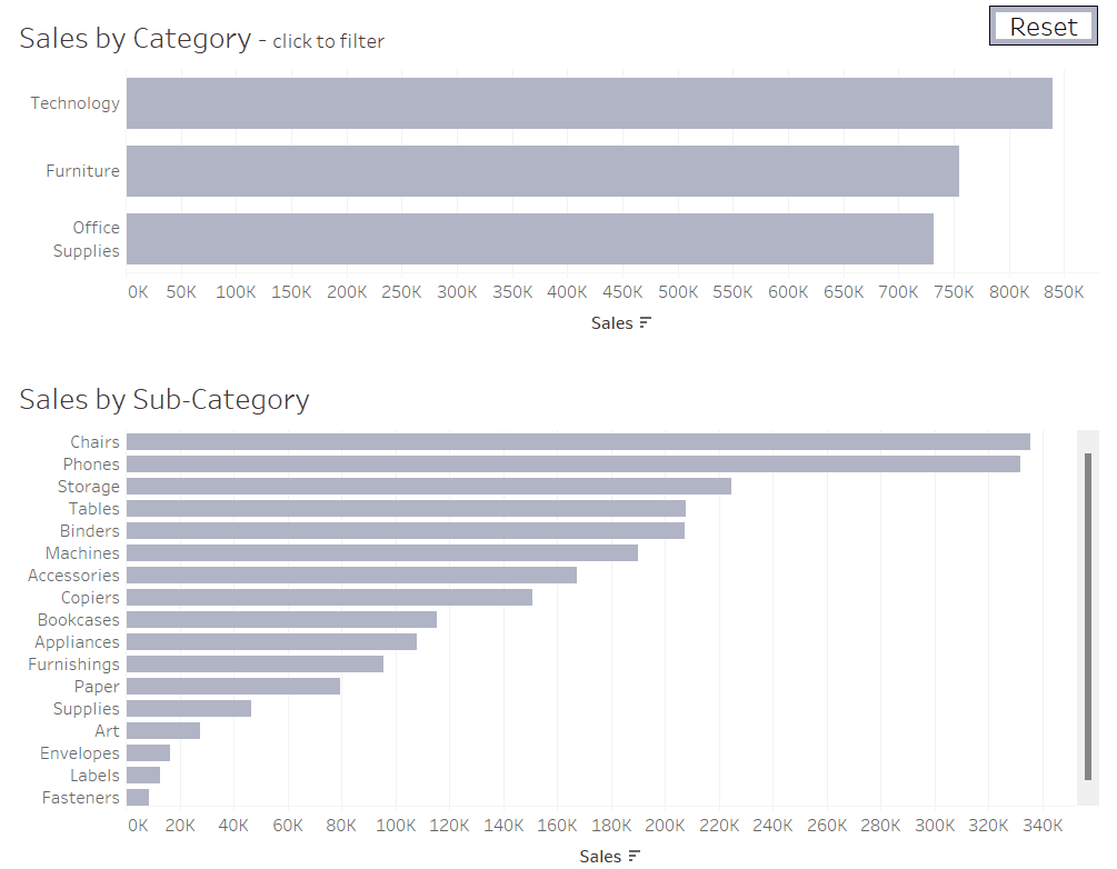
Below is a simple dashboard that shows Sales by Category, and Sales by Sub-Category. Clicking on the Sales by Category chart filters the Sales by Sub-Category chart.
The selected Category is being ‘highlighted’ by default on click, and the relevant Sub-Categories are displayed. Clicking the same Category to deselect the mark, displays all Sub-Categories again.
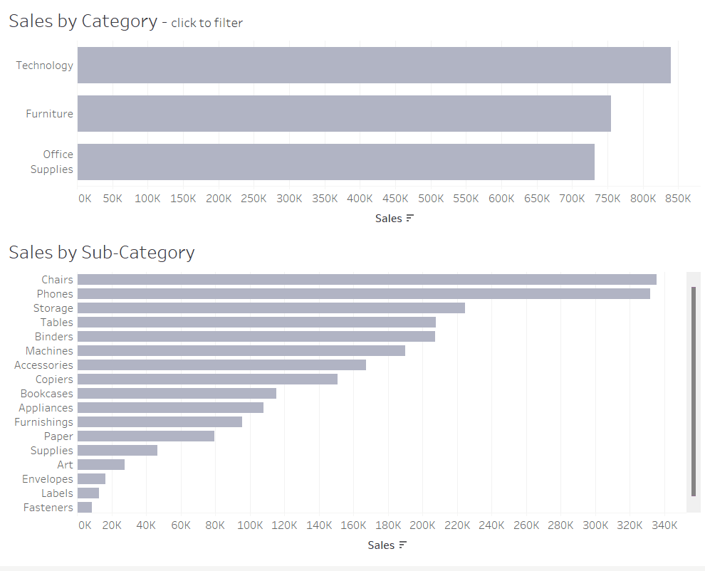
A simple dashboard filter action has been added to invoke this interactivity.
Let’s suppose you want to ‘highlight’ the selected Category by colouring it differently.
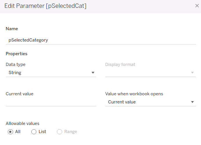
To do this, create a parameter:
pSelectedCategory
A string parameter defaulted to nothing / empty string
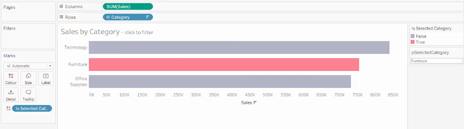
Create a new calculated field:
Is Selected Category
[Category] = [pSelectedCategory]
And add this to the Colour shelf of the Sales by Category worksheet. Adjust colours to suit (you will need to set a value for the parameter to make any True options appear - show the parameter and type in a value).
Now on the dashboard, add a parameter action that on click of the Sales by Category chart, will populate the pSelectedCategory parameter with the Category of the bar selected, and sets the parameter back to empty string when the bar is unselected

You will also need to adjust the original Filter action, to set the filter to just pass selected fields, in this instance Category (this is because of the addition of the Is Selected Category field onto the Sales by Category chart).

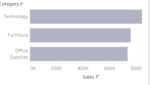
Now if you test the interactivity, the bottom chart is still filtered when the top chart is clicked on, but the Category selected in the top chart is highlighted by a different colour. However, the mark is still ‘selected’ based on Tableau’s default behaviour, so the other marks are faded out.
So, to prevent the marks from fading, you can apply the disabling / deselecting / unhighlighting technique described above.
Add new calculated fields True and False to the Detail shelf of the Sales by Category sheet. Then add a dashboard filter action that targets the Sales by Category worksheet, and passes True = False as the selected fields.
But while this action has now prevented the bars in the Sales by Category chart from fading on selection, the Sales by Sub-Category chart is no longer being filtered.

To now resolve this, you can make use of the pSelectedCategory parameter to determine how to filter the Sales by Sub-Category chart.
Create a new calculated field:
Sub Categories to Include
[pSelectedCategory] = '' OR [pSelectedCategory] = [Category]
This will return true if the parameter is empty or the Category associated to the row matches the parameter.
Add this to the Filter shelf of the Sales by Sub-Category worksheet and set it to True. Either all sub-categories will display (if the parameter is empty), or just those related to the selected category will be shown.
The original dashboard action that filtered the Sales by Sub-Category sheet on click of the Sales by Category sheet, can now be removed, as it is the parameter action that is now driving the filtering of the subsequent chart.
There should now only be two dashboard actions, one to set the parameter, and one to deselect the marks.

However, this still isn’t perfect. Once a selection has been made in the top chart, you are unable to revert back to a completely unselected state. This is because you can’t leverage the ‘clearing the selection’ behaviour of a dashboard action, as there is no option to ‘undo’ the true/false filter action.
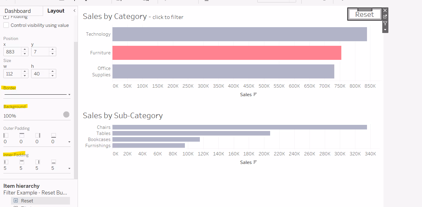
You will need to create a ‘button’ to reset the parameter.
Create a calculated field that contains an empty string
Category Reset
‘’
On a new sheet, add this field to the Text shelf. Then update the text with the word ‘Reset’ (or whatever label you want on the button).
Add the True and False fields onto the Detail shelf, as we will want to disable the highlighting of this sheet too. Set the background of the worksheet to white or whatever colour you want the button to be.

Add the sheet to the dashboard. To make it more ‘button like’, add a border to the object, set a background colour and add some inner padding.
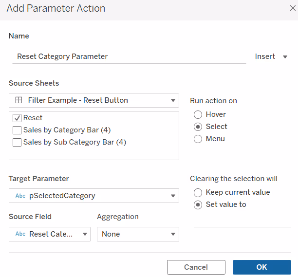
Add a dashboard parameter action, which on select of the Reset sheet, sets the pSelectedCategory parameter with the value from the Reset Category field.
Then add a dashboard filter action to ensure the reset button sheet doesn’t remain highlighted on click.

The changes made to the charts on the dashboard by clicking the Sales by Category chart can now be reset by clicking the reset button.

Alternative methods
As with many things in Tableau, there isn’t just one way to achieve the desired result.
The technique described above, to use a dashboard action filter, is probably the best as it can be applied to all mark types including text marks, as demonstrated with the ‘reset’ button.
It isn’t perfect, and requires further workarounds which have been documented. It may seem a bit cumbersome to set up, but once you’ve used the technique several times, it can become second nature.
But for completeness, here are some other ways to achieve a similar result, but these are dependent on the type of mark you’re working with.
Using a highlight dashboard action
You can use a dashboard highlight action to prevent the marks from ‘appearing’ to be highlighted on selection.
In the data pane, create a new calculated field
Highlight
‘HL’
This field can contain any text you want, you just need a calculated field that is a dimension that is not tied to your data set in any way.
Add this field onto the Detail shelf of the worksheet you want to control the highlighting for.

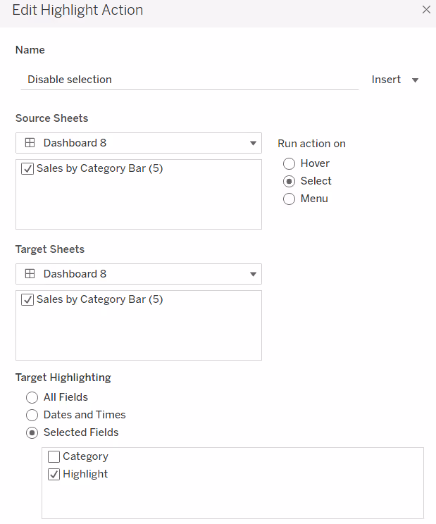
Add the worksheet to a dashboard, then add a dashboard highlight action (Dashboard menu > Actions). In the Actions dialog box that displays, select Add Action and choose Highlight.
In the Edit Filter Action dialog box, set the options as follows:
- Give the filter action an appropriate name
- Source sheets - select the dashboard and then the sheet on the dashboard you want to disable the highlighting for
- Set the action to run on select
- Target sheets - select the same options as in the source sheets section
- Target Highlighting by Selected Fields and select the Highlight field
Now when you click on a mark, the other marks don’t fade, although the selected mark is still in a ‘selected state’. There is a black border around it, and you need to click the mark again to deselect it.

This seems a neat and tidy workaround, with less effort to set up, and this method will still work with other filter actions, although you will need to add the same Highlight field onto the Detail shelf of the secondary chart to ensure the marks of the second chart aren’t ‘faded’.

However, if your marks are coloured at a reduced opacity, the highlight technique will show the marks at full opacity, which gets you back to where you started. In the example below the marks are coloured at 50% opacity in both charts.

This technique also doesn’t work if you use a text mark type, so if you don’t want to use the dashboard filter action concept with your text marks, you can try another alternative technique instead.
Using a transparent shape
You can use a transparent shape rather than a text mark type for sheets that you typically just display text on eg KPIs or ‘button’ sheets like the ‘Reset’ one created above.
You can create a transparent shape using Powerpoint by drawing the shape you want, setting the fill and outline colour to none, and then saving as an image. You then need to add the shape to your Shapes folder in the My Tableau Repository on your PC.
To recreate the ‘Reset’ button in this way, add the Reset Category field to the Text shelf of a new sheet. Change the mark type to shape and select the transparent shape.

Adjust the label text to display the word ‘Reset’, and align middle centre. Then add the sheet to the dashboard and adjust the object formatting to make it appear more ‘button like’. Add the parameter action filter to perform the rest action on click.
But it’s typically a KPI sheet that this may be most beneficial for. It's quite often you display KPIs on your dashboard that you don’t want the user to have any interaction with. But if it’s built with a text mark, and the user clicks, they get a blue box by default.

Changing the mark type to use a transparent shape instead, and there is no highlighting on click.
Summary
As you can see, different techniques can be used for different situations. The alternatives suggested, while perhaps simpler to implement, have limitations too.
You need to decide which method works best for the scenario you’re working with. If you think you can only remember one, then the dashboard action filter is probably the best option, as it covers all cases.
A workbook to accompany this post can be found here.


