


How to use bar charts: The good, the bad and the ugly
One of the important tasks in visual analytics is to address the question of how to visualize information in order to drive better decision making.
With powerful visual analytics tools at the ready, we’re capable of building dashboards at high speed and with great diversity in terms of chart types.
But despite our growing visual vocabulary, there appears to be one chart that rules them all: the bar chart. Bar charts are found everywhere, from typical business dashboards to scientific data presentations (more on that later) and became seemingly a standard solution for effective data visualizations.
In this blog post, we are going to look into the question why bar charts can be very effective and how to use them. But we will also address potential caveats, and how we can discover the unexpected by going beyond the bar chart.
How to use bar charts: the Good
Next to line charts, the bar chart is considered the main building block from which more advanced chart types are built (e.g., grouped bar chart, stacked bar chart, diverging bar chart, bullet graph, waterfall chart, ... ). There are several reasons why that’s the case.
When we display our data, we think about how we are going to encode the data. By using color, shape, size and other features, we can format our visualizations, provide visual cues for the viewer, and guide the attention. This visual encoding makes smart use of our innate ability to process visual information very efficiently due to preattentive attributes.
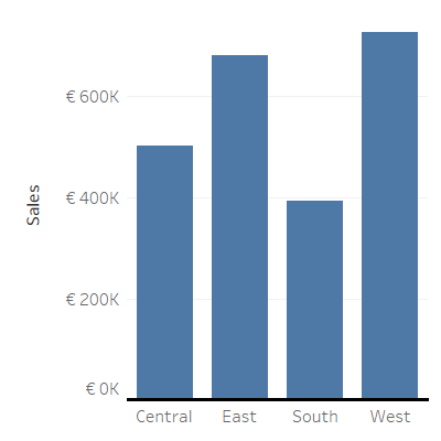
The bar chart makes very effective use of this, by encoding quantitative values as length (or height) from a common baseline. Additionally, changing the position of the bars by sorting them from left to right or from top to bottom, caters to the way most people read a chart.
The general appearance of a bar chart further adds to the understanding of the data we’re looking at. By using whitespace between the columns, the bar chart emphasizes we’re dealing with discrete categories, and each bar is of equal width because only frequency is at stake.
Both features are in contrast with a histogram, where the absence of whitespace highlights the continuity of the data, and the width of the bars may vary to tell us something about the frequency density. The common baseline starting at zero stresses the congruency between the length of the bar and a discrete quantity (i.e., a finite set), and avoids skewing the relative difference between categories.
It’s clear that the famous bar chart is highly effective for comparison and ranking, discerning patterns between categorical and ordinal data. Combining only two basic features, length and position, it beats everything by simplicity. But its omnipresence suggests that the bar chart is frequently used in an improper way, exceeding its purpose.
Using bar charts: the Bad
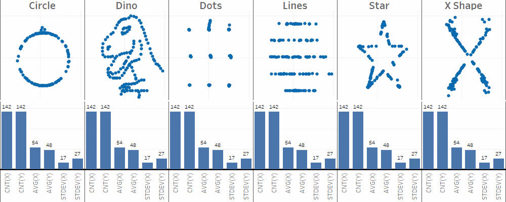
In many cases, bar charts are used to tell us something about general features of the data, while they show us very little about how the data itself looks like. In fact, they leave a lot to the imagination of the viewer.
A scientific paper discussing the use of bar charts in scientific literature gained wide support in the academic world, prompting many journals to adopt new visualization policies. The message was unambiguous: bar charts muddle accurate interpretation of the underlying data, especially when representing summary statistics of continuous data.
When we start comparing summary statistics of continuous data (e.g., mean, median, standard deviation, mode, …), things get more complicated than with nominal or ordinal data. Summarizing data using measures of central tendency, causes several issues.
First, different distributions of data may cause the exact same bar graph. Second, by using measures of central tendency per se, we cause the viewer to wrongly assume that the data is normally distributed without any outliers.
And third, when we deal with time series or paired data, we erroneously suggest that the different groups or time bins are independent from each other.
One could argue that, when dealing with real business cases, most of these concerns do not apply. For example, we don’t deal with small sample sizes that may cause distortion of the real internal structure of the data. One could even argue that, since we’re dealing with large amounts of data, we don’t need to care about the underlying structure in any way. Both arguments are valid… sometimes.
The third issue, however, is less influenced by the nature of the data we deal with. Time can be treated as ordinal and discrete; think about the days of the week, which we can further group into weekdays and weekends.
But in most situations, time is continuous and independence between different time points is not met. Besides, are your workweek and weekend really independent from each other?
Using bar charts: the Ugly
Whether you find a bar chart ugly or not, is completely up to you. Nevertheless, we can hardly call it original or creative considering its omnipresence in dataviz.
Most people tend to go for the comfortable and the familiar, here coined as the inertia of common practice. When William Playfair invented the bar chart, somewhere in the 1870ies, the only prerequisites for a successful bar chart were paper, a straightedge, and a pencil.
And until now, we barely deviated from the graphical language and techniques the great John Tukey proposed in his groundbreaking work on ‘exploratory data analysis’ to tackle the challenges that come along with it.
It is interesting on its own that we render data at unprecedented speed and accuracy by using very powerful visual analytics tools, but still use very basic graphical ways to visualize it. With the risk of downplaying our favorite workhorse, I invite you to go beyond the bar chart and try to look beneath the surface.
Visualizing summaries of data can be a different thing than visualizing data. Be mindful of the effectiveness and simplicity of the bar chart, but also be aware of how deceiving its simplicity can be.


