Callouts are a great way to draw your users’ gaze to a specific area of the visualisation which requires special attention.
I am going to use two different methods to create these callouts;
- The first callout example is using a discrete measure and sits on the left-hand side of the visualisation, together with the other discrete fields.
- The second example also has the callout as a discrete measure but uses it as a label.
- I will use this technique to call out 1 state, as well as 2.

I will be showing how to call out 1 and 2 different states (Alert / Warning). Calling out too many points will lose the value of the callout, as it will be harder to discern what is important.
Using a single callout will mean that everyone, regardless of their colour sensing ability will be able to understand the callout. Having multiple different colours will require a substantial difference in hue and/or saturation to better accommodate people who have a vision deficiency. Alternatively, you could use different shapes.
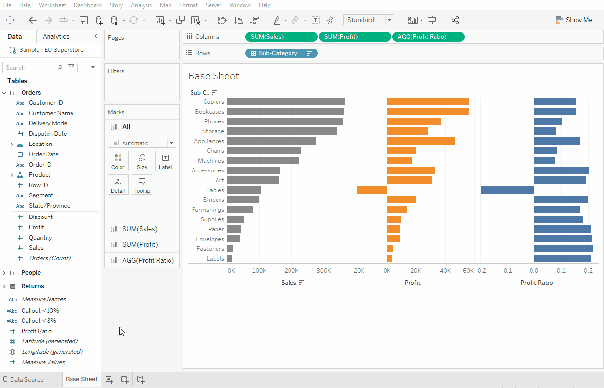
1) Create the base view.
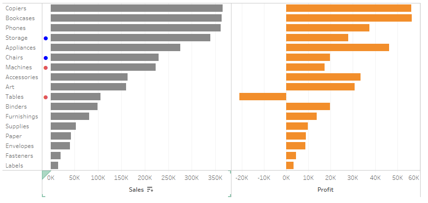
In our example, I want to see Product Sub Category with line charts for Sales and Profit.

➥Sub-Category on Rows, Sales & Profit on Columns, sort by Sales, colour Sales grey and Profit orange
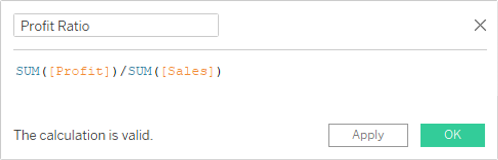
2) Add a Profit Ratio calculation
I will use this as our callout
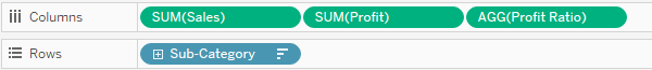
3) Add Profit Ratio to the viz
I want this in the viz initially to see where to put our breakpoints for the callouts
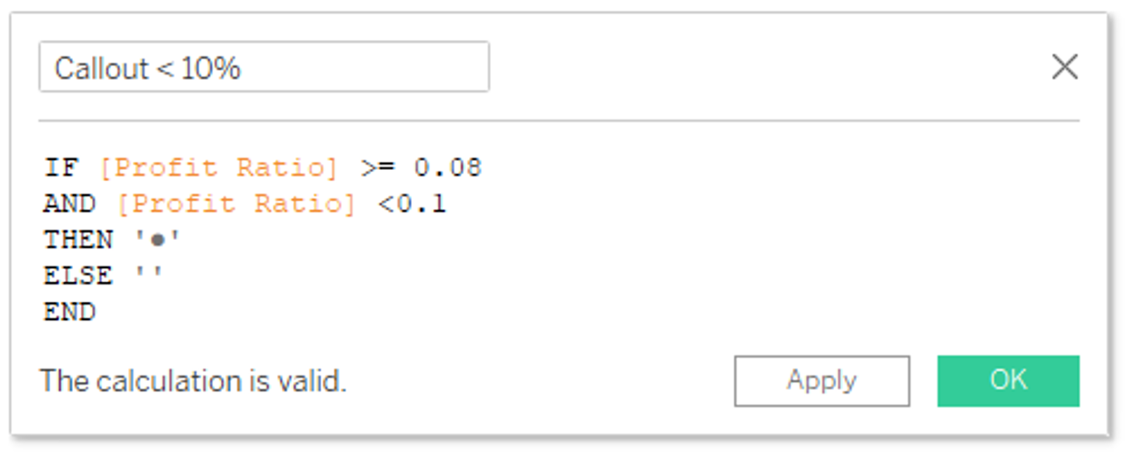
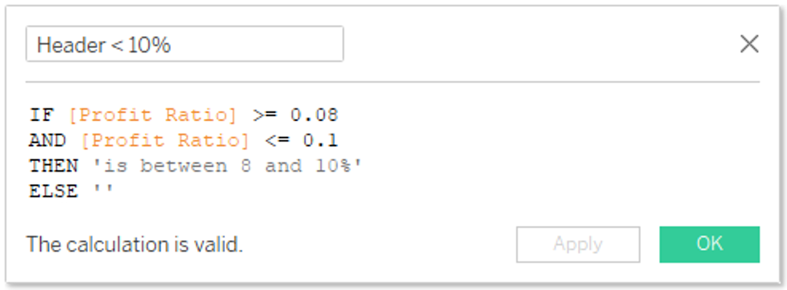
4) Create callout calculations
I am going to create two callouts: Callout < 8% and Callout <10% as examples of how a business can call out areas of concern at levels set by them.
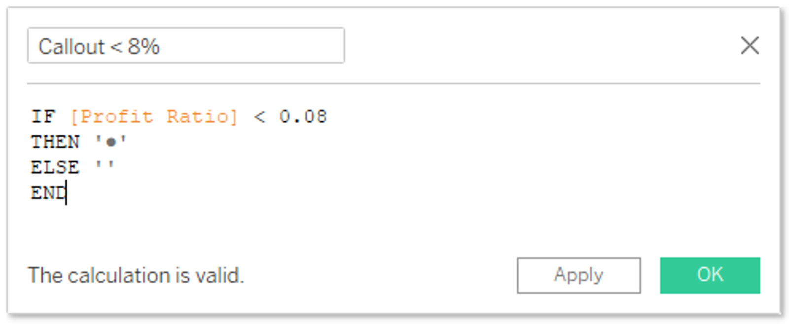
The ‘●’ is a standard Unicode character. This and more examples can be found at https://www.compart.com/en/unicode/search?q=circle#characters
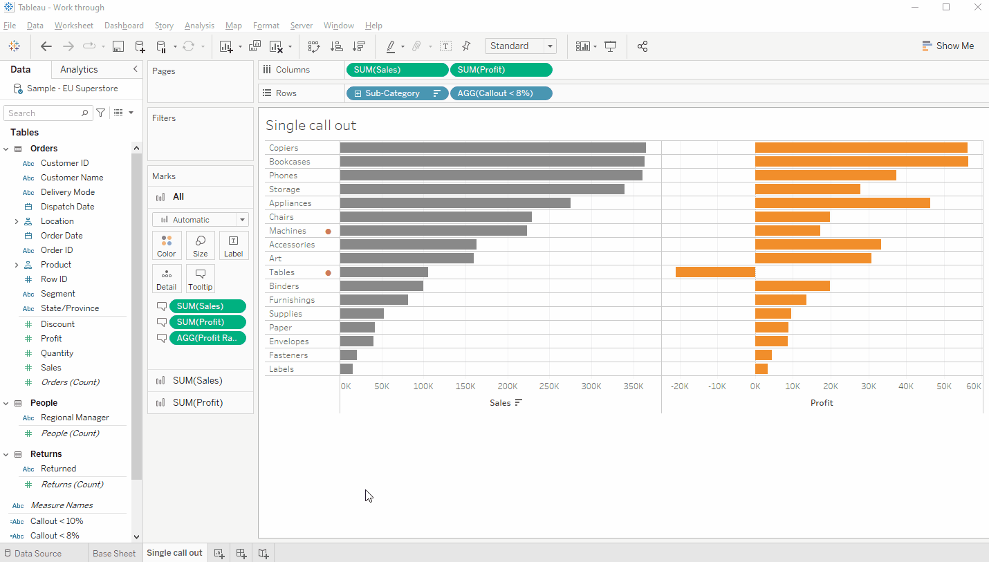
5) Put together the first callout visualisation
This version will only accept one specific state to call out per Column as we are putting the colour on the font of the pill.
➥Duplicate and rename sheet. Add Callout < 8% to rows, copy Sales & Profit to tooltip, move Profit Ratio to tooltip. Add Callout < 8% just after the Profit Ratio in the tooltip and Format to make the circle bigger and red.
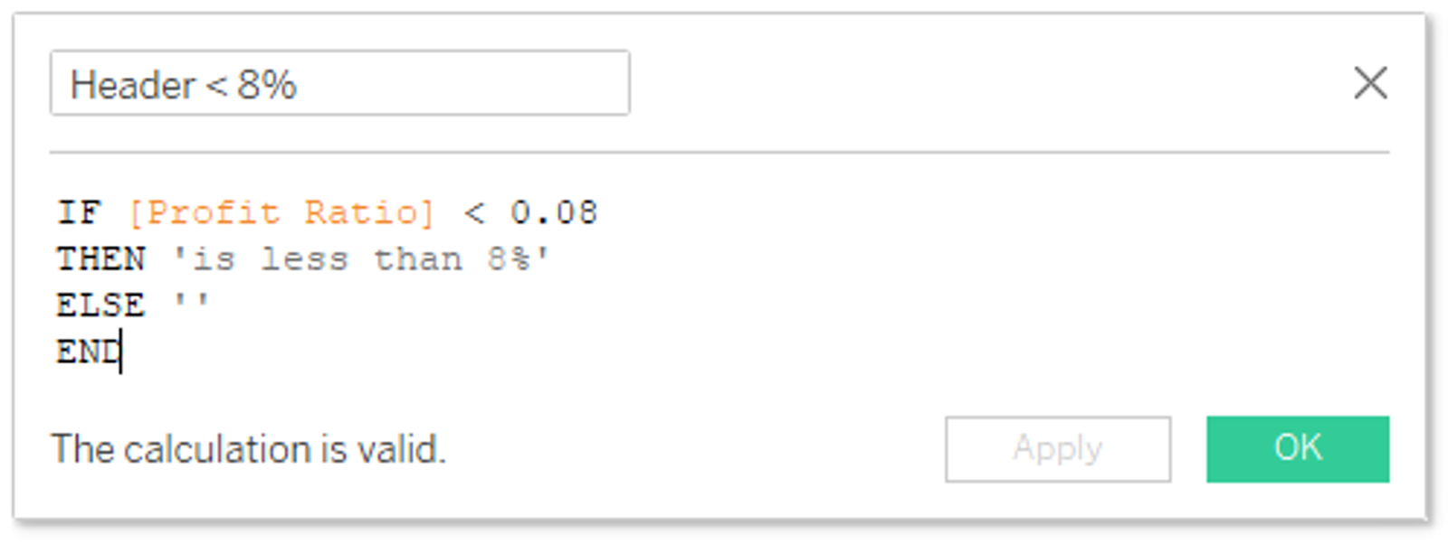
6) Additional calculations
To allow the tooltip for the callouts to be dynamic I need to create an additional calculated field, which shows the reason for the callout if there is one. As I will be doing a multi-level callout later, I will do both <8% and <10%
8) Create a transparent shape (if you don’t already have one)
Transparent shapes can be useful for many different purposes as can be seen in this post by Luke Stanke and this one by Kevin Flerlage
Creating a transparent shape is quite simple using your favourite image manipulation program, I use PowerPoint for most of mine as it’s free and can do a surprisingly large proportion of what I need. Open PowerPoint and create any shape you want. Change the fill colour to “No Fill” and outline colour to “No Outline”. Right-click on the image and “Save as Picture” and save it to the shapes folder in your Tableau Repository.
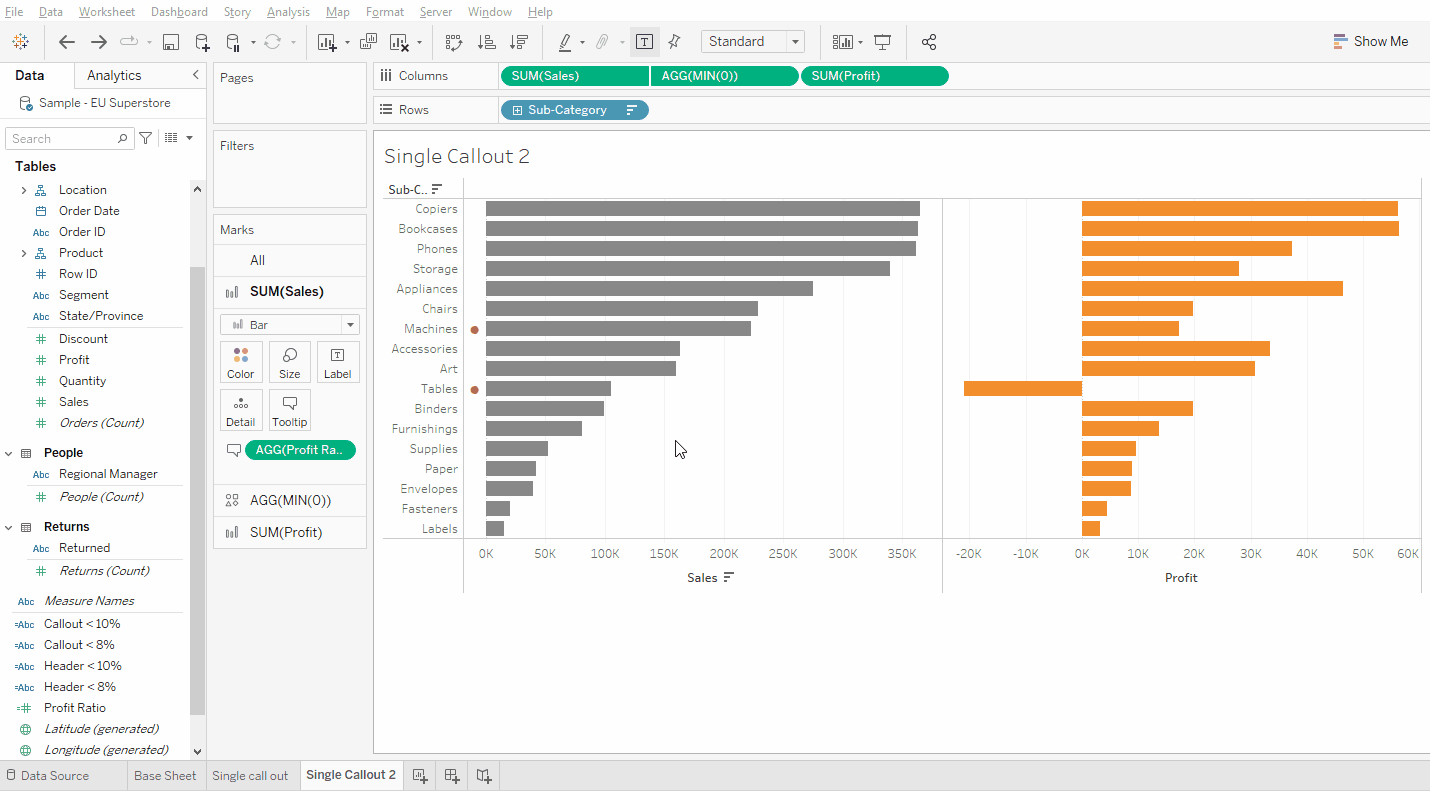
9) Put together the second callout visualisation
This version will accept multiple states to call out as I am putting the colour on the font of the measure in the label section. I will be using MIN(0) to create a placeholder in the visualisation to hang a label from.
➥Duplicate and rename Base Sheet. Put Profit Ratio on Tooltip for All cards. Create a pill MIN(0) and place it between Sales and Profit. Dual axis Sales and MIN(0) and synchronise axis. Untick show header on the MIN(0) axis. Set the Sales and Profit mark type to Bar and the MIN(0) to Shape, using a blank shape. Drag Callout <8% to Label on the MIN(0) card, change alignment to left in the label card, make the font bigger and shade red in the text box
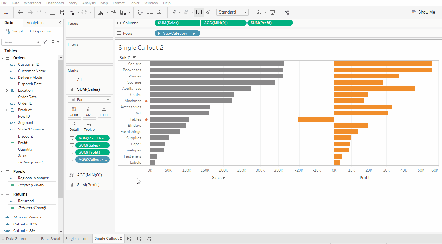
10) Tooltip and tidy
To finish off this viz I’ll do a few tidying steps and ensure the tooltips are informative (if not pretty).
➥For the Sales and Profit cards, add Sales, Profit and Callout < 8% to the tooltip and organise & shade. For the Min(0) add Header <8% to the tooltip and organise & shade. Make the size of the Min(0) shape as small as possible.
11) Multi-level callout
Finally, I’ll add a second level of callout in a different colour for a different breakpoint. I’ll colour these blue to get enough contrast to the red used for the lowest level of Profit Ratio to be able to tell the difference.
➥Duplicate the worksheet and rename. For the Sales and Profit cards, add Callout <10% to the tooltip, organise and shade. For the MIN(0) card add Header <10% to the tooltip and Callout <10% to the Label, organise and shade. Tick Allow labels to overlap other marks
And there you have it!
- Kurt
I have published the workbook on Tableau Public, so feel free to download it to have a look if there is anything which isn’t clear.
Thank you go to the ever-supportive Donna Coles for coming up with the solution.