Interactive dashboards are excellent way to track, analyze and display your data with various gamut. Tableau is a great tool to build user-friendly and customized interactive dashboards which allows you to create tooltips, filters, sets, parameters and many sheet and dashboard actions. When it comes to options to display different values within the same dashboard or visualization, dynamic dimensions could be your friend.
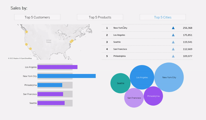
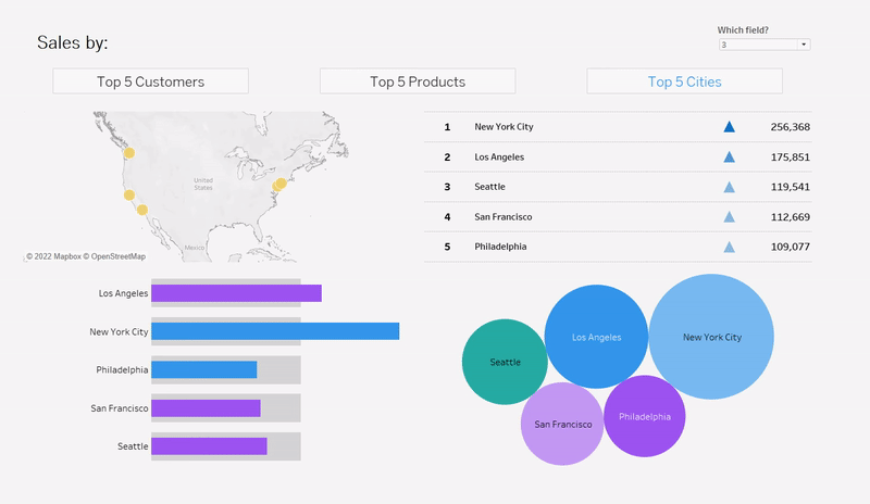
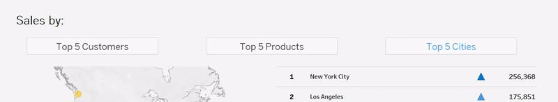
Here is a trick to change your dimensions of your visualizations using parameters and calculated fields. Let’s go over this trick with an example. Here is a simple dashboard built using superstore sample dataset showing sales in different categories. The buttons above are for users to pick top 5 fields based on sales: customers, products, and cities. When user clicks on the buttons, our graphs/tables alter accordingly.
1) Create a parameter that would change the view.
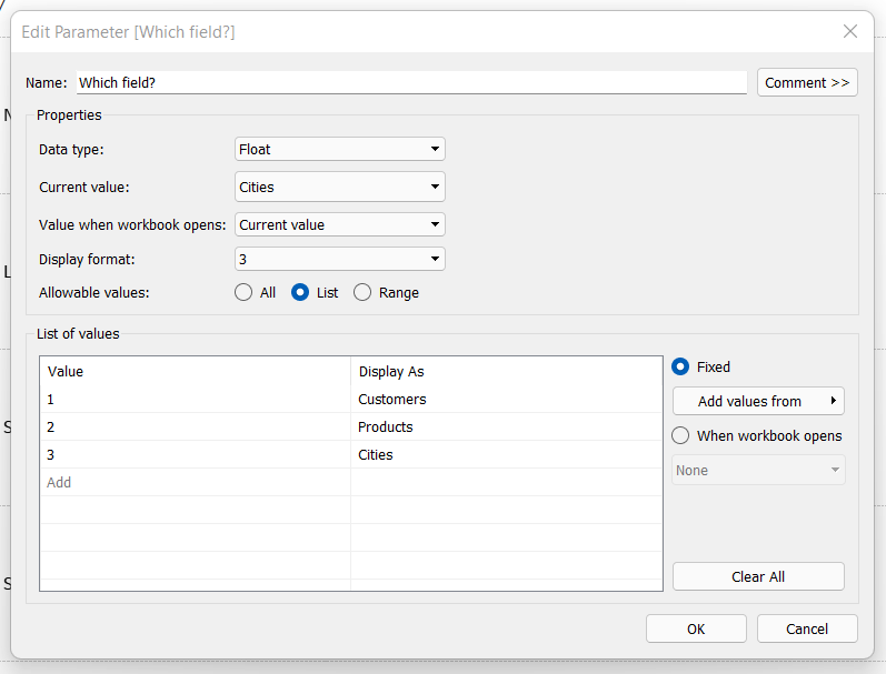
In our example, we want to see our graphs and tables in 3 different categories. Customers, products, and cities.
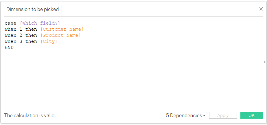
2) Create a calculated field for our dynamic dimensions
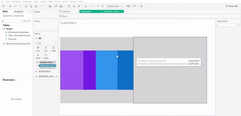
3) Place your calculated field in your viz
4) Create sets
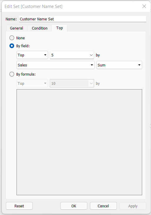
As we want to see top 5 values based on sales, we need to create sets to filter.
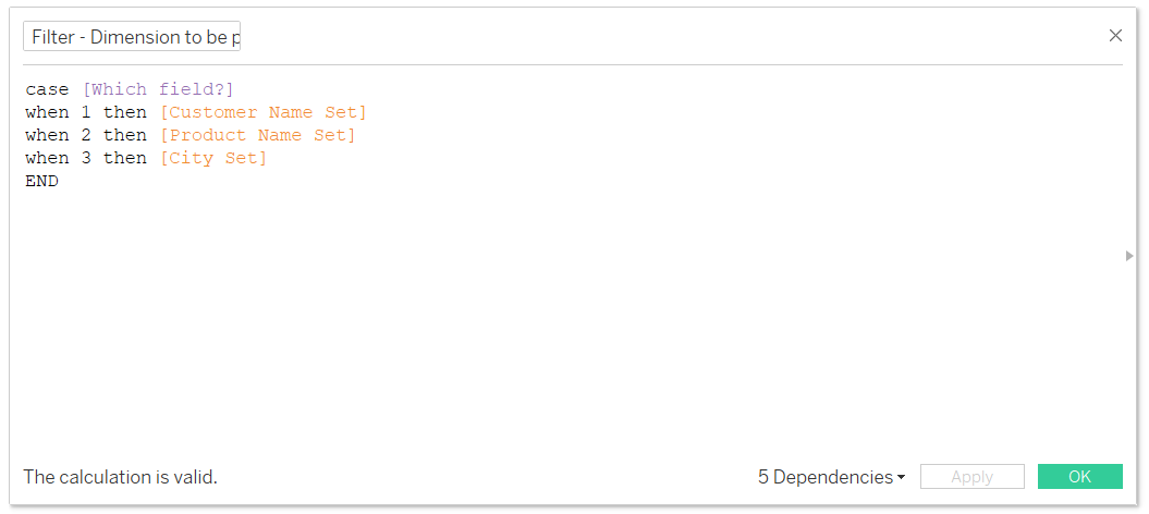
5) Create another calculated field for sets and place it as filter
6) Implement this to all your graphs/tables
You can either use the dropdown or make your own buttons to stand out your interactive dashboard. Let’s now dive into how we can build those buttons with highlighting effect:
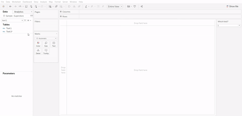
1) Create a new worksheet
2) Create two calculated fields for your text using the parameter created previously.
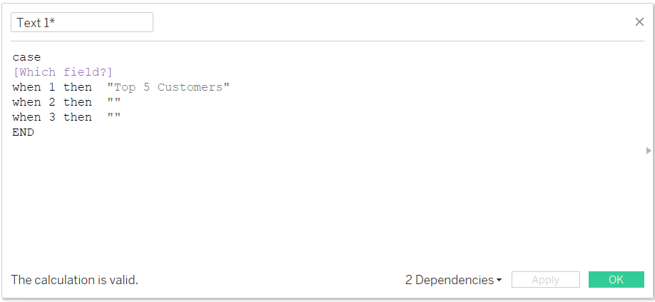
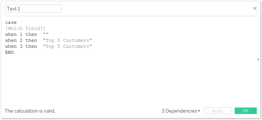
So basically, we are hiding one text when the button is not clicked, while the rest will be colored black and hiding the other two when it's clicked while the remaining will be colored blue.
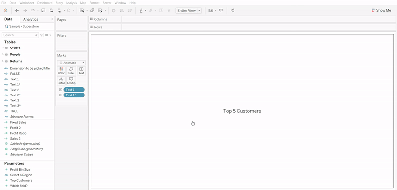
3) Place these calculated fields in your marks and adjust with the font, font size or colour as you like.
4) Put a dummy number on your sheet to create your parameter action. In this case, 1 will be the value which we have coloured text in.
5) After placing your worksheet to your dashboard, resize as you wish and then go to dashboard > actions. Create a parameter action as:
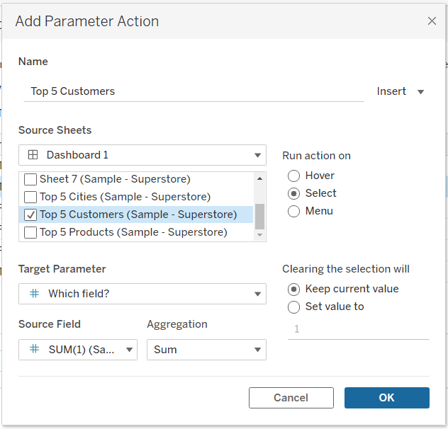
6) Implement the same procedure to other buttons.
And it’s ready!
You can get as creative as you wish to stand your buttons out - have fun!
Now that you know how to change your dimensions of your visualizations using parameters and calculated fields, did you know that you can improve the visualisation of worksheets by excluding marks from the worksheets, without using the tooltip feature? Follow the short method described in this article.