The power of a union in Tableau
Case
Our client is the owner of a retail chain. They want to offer their suppliers insights into their current sales share and what the impact of a different product placement level in the store could be.
Our client's goal was to provide their sales people with a tool that they can use to convince the supplier in the negotiations for investing in the best performing, and most expensive, product placement level.
Product placement level?
Effective in-store product placement will boost brand recognition and maximize sales, but it comes with a higher price.
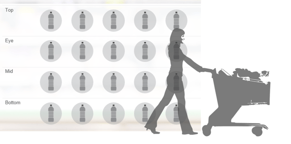
Their store shelves are grouped into 4 different levels:
-
Top-level
-
Eye-level
-
Mid-level
-
Bottom-level
Result
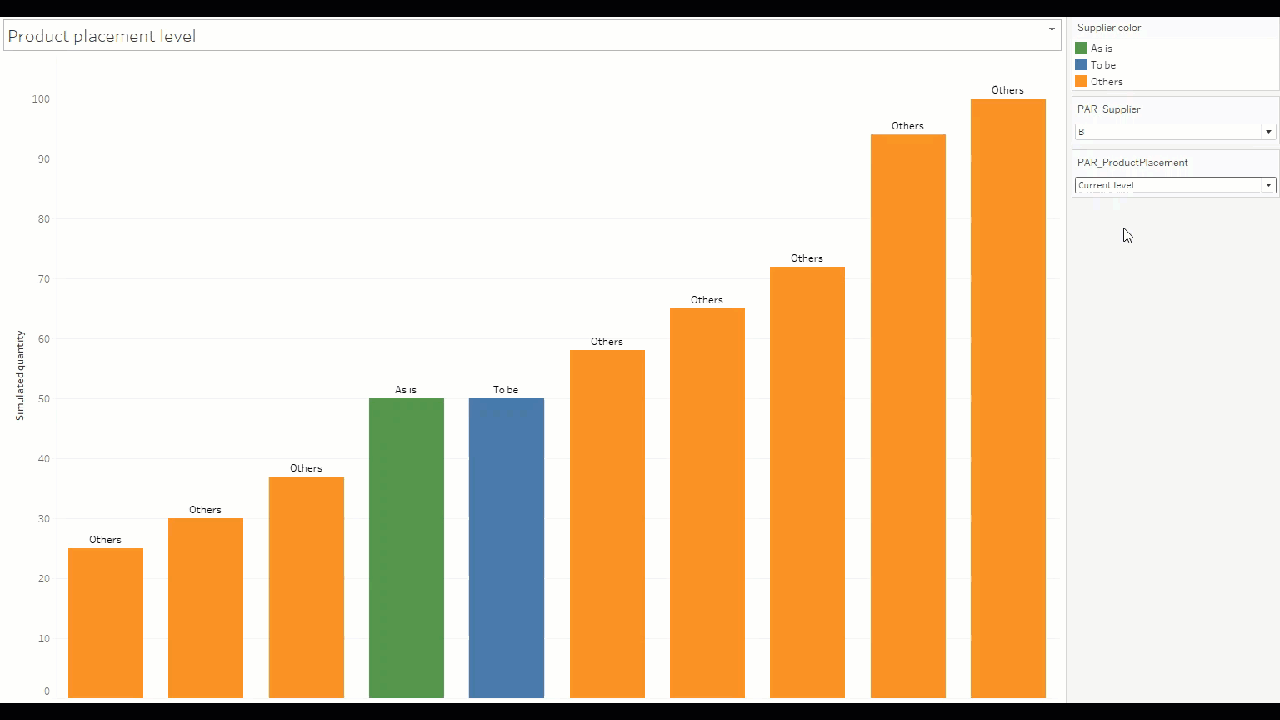
Here you can find a simplified representation of the result.
-
The X-axis displays the different suppliers of competing brands. They are ranked ascending based on their amount of sold quantities.
-
The Y-axis shows the actual sold quantities.
-
A drop down menu is available to select the desired supplier and the product placement level
-
Green, the "as is" situation for the selected supplier
-
Blue, the "to be" situation depending on the selected product placement level
-
Orange, the "as is" situation of the competitive suppliers
Key insights
Our client has 4 different levels of product placement. By measuring the sales of a certain product by placing it on a different level for several weeks, they have come to the following conclusion.
"Eye level is buy level"

Based on the research they added a percentage of increased sales performance to each product placement level. The percentages used in this example are fictional:
-
Top level: 0,75%
-
Eye level: 1,35%
-
Middle level: 1,10%
-
Bottom level : 0,5%
Difficulty?
The client wanted to maintain the original value for a better overview of the impact.
We had to create an extra value to visualize the simulated sales without changing the current data source.
Depending on the selected level, we need to create an extra bar in the bar chart as the "to be" value and maintain all the "as is" values from each supplier.
How?
Requirements in this case:
-
1 Data source
-
1 Union
-
4 Calculated fields
-
2 Parameters
-
1 Custom sort
Through the union, Tableau created an extra dimension "Table Name". We use this extra dimension to indicate whether the duplicated rows should be multiplied by the corresponding percentage of the selected product placement level or not.

If you want to try this yourself, you can download the step by step solution, the workbook or you can watch this video tutorial.
- Bram
Empower your organization with intuitive analytics
Tableau is designed to put the user first because data analysis should be about asking questions and not about learning software. With built-in visual best practices, Tableau enables limitless visual data exploration without interrupting the flow of analysis.
As the market-leading choice for modern business intelligence, the Tableau platform is known for taking any kind of data from almost any system and turning it into actionable insights with speed and ease. It’s as simple as dragging and dropping.
We are a full-stack provider and integrator, relying on extensive experience and best practices to find your unique optimal set-up allowing you to tell the data stories you are eager to tell.