Visualize your employee turn-over using Table Calculations
Recently, I got a request from a client to build an historical view of the movements in the department. At first, the request seemed very easy since I had a start date and an end date for each employee. Unfortunately, the data was not accurate enough to satisfy the client request (or me)..
Some background information on the data.
As we refresh it monthly, it means that a lot can change and could mess up the visualization. This is particularly true for the dates. As the data comes from various sources, it’s possible that some of the dates change over time. This is sometimes correct because a person sees her contract renewed or a new person comes in later than the initially planned date but if the dates are wrong you can’t use it to check when an employee joins or leaves.
Besides the date, the client wanted to keep a certain logic in its way of counting FTEs during a month which also added to the challenge.
The LOOKUP function to the rescue
Based on the data at my disposal, I was only able to show half of what the client expected. My saviour was the LOOKUP function.
The LOOKUP function is a table calculation that lets you get the value at a certain offset. For instance, if you consider the following table showing SUM of Sales over Month of Order Date:
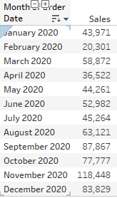
You can use the LOOKUP function to compare the values of each month with the values of the month before. First, you need to create a calculated field and name it Sales - Previous Month:
LOOKUP(SUM([Sales]),-1)
You can then add this field in your view and you’ll see that Tableau is now showing the Sales value for the previous month:

So this is the starting point to my solution for the incoming and leaving employees. As I can’t use the client data, I’ll use the sample - superstore dataset. The logic I want implement is:
-
IF an employee is not anymore in the data of a certain month, we consider that he/she is out.
-
IF an employee was not in the data of a certain month and appears the next month, we then consider this employee as a new employee.
-
IF an employee appears in the current month and the month before and after, it means that the employee still is in his/her position.
To translate that into a calculated field, I use the LOOKUP function in combination with an IF...ELSE IF statement and name it “Who’s in & Who’s Out ?”:
//ISNULL is a function that checks whether the data is returning a NULL value or not. It returns a BOOLEAN value: TRUE or FALSE
IF ISNULL(COUNTD([Customer Name])) AND LOOKUP(NOT ISNULL(COUNTD([Customer Name])),-1) THEN 'Leaving'
ELSEIF NOT ISNULL(COUNTD([Customer Name])) AND LOOKUP(ISNULL(COUNTD([Customer Name])),-1) THEN 'Onboarding'
ELSE 'Current' END
With this calculated field, I will be able to label each customer as being leaving, incoming or current. So far we are checking if the Count Distinct of Customer Name is NULL or not in the previous row and in this case in the previous month but I’ll come back on that point later.
We still need another calculation in order to visualize our leaving employees (because Tableau can’t show non-existing data). To solve this problem, we need to create a new calculated field that will return a value when we encounter a leaving employee.
I create a calculated field called “COUNTD Customer Name”:
IF ISNULL(COUNTD([Customer Name])) THEN -LOOKUP(COUNTD([Customer Name]),-1) ELSE COUNTD([Customer Name]) END
This field also checks if the Count Distinct of Customer Name is NULL, meaning the user doesn’t exist for the current month. If this is the case then it returns the result of the lookup function which fetches the Count Distinct of the previous row. Otherwise, it returns the Count Distinct of Customer Name.
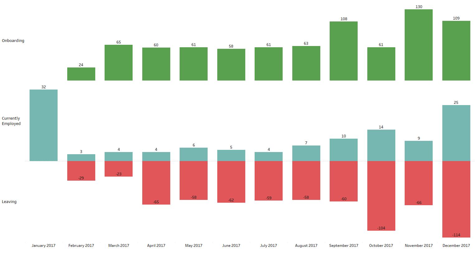
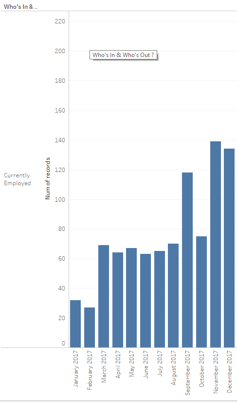
I now have all the ingredients to build my view. I start by putting the Month-Year of Order Date as discrete on the Columns shelf. I then put the Who’s In & Who’s Out calculation on the Rows shelf along with Customer Movement. At this point, my visualisation is looking like this :
I only have one label and I see the Customer Movement. To make my calculated field return all my labels, I need to add another dimension in my view: Customer Name. The reason behind this is the fact that the calculation is based on this dimension. To illustrate this, let’s look at Alan Schoenberger who is a customer in Sample - Superstore (Default demo data set of Tableau):
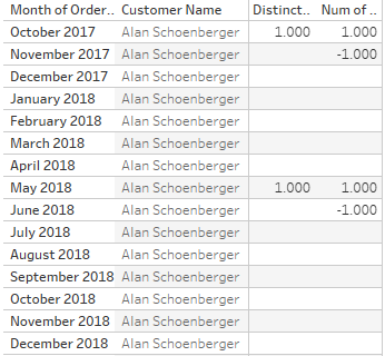
The table shows the Count Distinct of Customer Name and my calculated field Customer Movement. You notice that the calculated field returns one more value compared to the Count Distinct of Customer Name. This is the result of the LOOKUP function. If you look at November 2017, there is no data for Alan Schoenberger. If we follow the logic of the calculated field, Tableau will look one row up in the Table and fetch that value and make it negative.
To finish my view, I add the Customer Name on the Detail mark. I also add the Who’s In & Who’s Out field on the color mark to make more clear
I can clearly distinguish the three labels I defined and analyse who left, who joins and who remains.To lighten a bit the view, I removed the Y-axis but added a label for the sum of all customers within a category within a month by adding a reference line and use the SUM aggregation. I also changed the order of the labels
This is one of the many ways to use the LOOKUP function and I encourage you to discover more use cases by practising in Tableau Desktop.
Download the example Tableau Workbook here.
- Charles
Empower your organization with intuitive analytics
Tableau is designed to put the user first because data analysis should be about asking questions and not about learning software. With built-in visual best practices, Tableau enables limitless visual data exploration without interrupting the flow of analysis.
As the market-leading choice for modern business intelligence, the Tableau platform is known for taking any kind of data from almost any system and turning it into actionable insights with speed and ease. It’s as simple as dragging and dropping.
We are a full-stack provider and integrator, relying on extensive experience and best practices to find your unique optimal set-up allowing you to tell the data stories you are eager to tell.