
In Tableau, filters slice your data based on values that exist in the data source, while parameters are user-controlled inputs that can drive calculations, filters, and reference lines. The key difference is that parameters can be used inside calculated fields and filters cannot, which makes parameters the right choice whenever you want one selection to drive several visuals in different ways.
This guide walks through the differences and shows you how to use a parameter as a date filter to compare current and previous year data on the same dashboard.
Parameter vs filter in Tableau: what's the difference?
A filter restricts the data shown in a worksheet to a subset of values that exist in your data source. A parameter is a workbook-level variable (a number, date, string, or boolean) whose value the user controls, and that you can plug into calculations, filters, reference lines, and titles.
Here is how they compare side by side:

Filters can work across data sources using data blending, but blending has its own limitations.
The bottom row of that table is the one that matters most for this tutorial. Because parameters can be used inside calculated fields, they let you do things a filter alone cannot, like driving two visuals in two different ways from the same user input.
When should you use a parameter instead of a filter?
A filter is usually the right tool. Reach for a parameter when you hit one of these situations:
- You want one selection to drive multiple visuals in different ways. For example, picking "March 2024" should show this March's sales on one chart and last March's sales on another. A filter would hide last March from both.
- You need to filter across data sources without using data blending.
- You want to swap measures, dimensions, or sort orders based on user input (a parameter inside a calculated field).
- You need a "what if" input for a reference line, scenario modelling, or threshold check.
The use case we are about to build falls into the first category. We want a single date picker that drives one visual showing this period's data and another showing the same period last year.
What we're looking for should look like this:

How to use a parameter as a date filter in Tableau
Here is the full 5-step build. We will use the Sample Superstore dataset, but the technique works on any data source with a date field.
Step 1: Create the date parameter

Right-click in the Data pane and select Create Parameter. Configure it as follows:
- Name:
p.Date Selector - Data type: Date
- Allowable values: Range
- Set from field:
Order Date(this pulls the min and max dates from your data so the parameter knows the available range) - When workbook opens: Tick this so the parameter dynamically updates whenever the workbook is refreshed
Setting the data type to Date is important. Keeping the parameter as a true Date (rather than a string of date values) gives you cleaner performance and access to all of Tableau's date functions later.
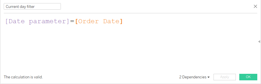
Step 2: Create a calculated field to mask the parameter as a filter

This is where the magic happens. We are going to write a calculated field that returns TRUE when a row's date matches the parameter, and FALSE otherwise. Putting that field on the Filters shelf and setting it to TRUE turns the parameter into a working filter.
Create a calculated field called Filter: Current Period:
DATETRUNC('month', [Order Date]) = DATETRUNC('month', [p.Date Selector])
DATETRUNC('month', ...) rounds both dates down to the first of the month, so any order placed in the same month as the parameter selection returns TRUE.
If you want a day-level filter instead, drop the DATETRUNC and compare the raw dates:
[Order Date] = [p.Date Selector]
Step 3: Apply the filter to your current-period worksheet
Build the worksheet that should show current-period data (for example, a bar chart of sales by sub-category for the selected month). Then drag the Filter: Current Period calculated field onto the Filters shelf and select True.
Right-click the parameter in the Data pane and choose Show Parameter to make the date picker visible on the worksheet.
Test it. Change the parameter value and the worksheet should refilter to show only the data for the selected month. Functionally this is no different from a normal date filter so far, but the next step is where parameters earn their keep.
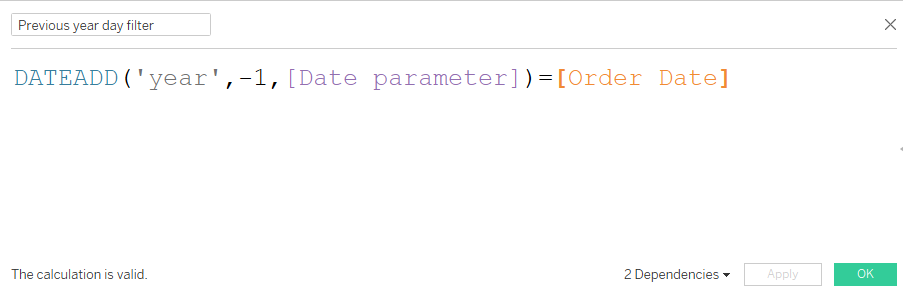
Step 4: Duplicate the calculation with DATEADD for the previous-period worksheet

Now build the second worksheet, the one that should show the same period last year. Create a new calculated field called Filter: Previous Year:
DATETRUNC('month', [Order Date]) = DATETRUNC('month', DATEADD('year', -1, [p.Date Selector]))
The DATEADD('year', -1, ...) shifts the parameter selection back one year before the comparison runs. So when the user picks March 2024, this calculation returns TRUE for any order placed in March 2023.
Drag Filter: Previous Year onto the Filters shelf of the previous-year worksheet and set it to True.
Rinse and repeat for the day-level visuals.
Now you have two visuals on the same dashboard, both driven by one date picker, each showing a different time period. A standard filter cannot do this because a filter removes the prior year's rows from the data entirely.
You can extend this pattern to any time comparison: previous month, same week last year, two years ago, fiscal-year-to-date. Just change the DATEADD interval. For finer-grained control, our guide to parameter actions shows how to drive the parameter from clicks on the dashboard rather than a dropdown.
Step 5: Add a dynamic title that updates with the parameter

A small finishing touch that makes the dashboard look professional: have the chart titles include the selected date.
- Create a calculated field that contains only the parameter:
Title Date=[p.Date Selector]. - Drag this calculated field onto the Detail mark of the worksheet.
- Double-click the worksheet title to edit it.
- From the Insert menu in the title editor, choose your
Title Datefield.
Now the title will read something like "Sales for March 2024" and update automatically when the user changes the parameter. For more title-customisation techniques, see our guide on how to personalise your Tableau dashboards with custom titles.
Common issues and how to fix them
Problem: The filter returns no data, even though the parameter is set to a valid date.
Fix: Check the data type of your parameter. If it is set to String instead of Date, the DATETRUNC comparison will fail silently. Edit the parameter and set the data type to Date.
Problem: The parameter dropdown shows old dates that are no longer in the data.
Fix: Open the parameter and tick Set from field > Order Date with the When workbook opens option enabled. This makes the parameter refresh its min/max range each time the workbook loads. Without this, the parameter is stuck with whatever range existed when you first created it.
Problem: The previous-year worksheet is empty for the most recent month.
Fix: Your data does not contain orders from one year ago for that month. This is common with truncated datasets like Sample Superstore. Pick a date earlier in the range to confirm the calculation is working, then check your real data for coverage.
Problem: The dynamic title displays the raw parameter value like "3/1/2024 12:00:00 AM" instead of "March 2024."
Fix: Right-click the Title Date calculated field in the Data pane, choose Default Properties > Date Format, and select a cleaner format like "March 2024" (mmmm yyyy).
Problem: Changing the parameter does not update the visuals.
Fix: Make sure the Filter: Current Period and Filter: Previous Year calculated fields are on the Filters shelf and set to True. If they are on Rows, Columns, or another shelf, they will not filter the view.
Frequently Asked Questions
What is the difference between a parameter and a filter in Tableau?
A filter restricts the data shown in a worksheet to values that exist in the data source and cannot be used in calculations. A parameter is a workbook-level user input (a number, date, string, or boolean) that can be plugged into calculations, filters, reference lines, and titles. Parameters work across multiple data sources; filters are tied to one.
Can a parameter act as a filter in Tableau?
Yes. Create a calculated field that compares the parameter to a field in your data (for example, [Order Date] = [p.Date Selector]), drag the calculated field onto the Filters shelf, and set it to True. The parameter now behaves like a filter, but with the added flexibility that you can also reference it inside other calculations.
Why use a parameter instead of a filter for date comparisons?
Because a standard filter removes the rows it filters out. If the user selects March 2024 and you want to also show March 2023 on another chart, a filter has already deleted March 2023 from the data. A parameter does not delete anything, so you can use it inside a DATEADD calculation to drive a second worksheet showing the prior year.
Can I make a Tableau parameter multi-select?
Not directly. Parameters are single-select by design. If you need multi-select behaviour, you can simulate it with a multiple select parameters workaround that uses a set or a string-based parameter with conditional logic. For true multi-select, use a standard filter or a set action.
Conclusion
The "parameter or filter" question is one of the most common decisions in Tableau dashboard building, and the answer is usually the same: use a filter unless you need something a filter cannot do. The moment you need one input to drive multiple visuals differently, or you want to compare a current period to a prior one on the same dashboard, parameters become the obvious tool.
The masked-parameter-as-filter pattern in this guide is a workhorse technique. Once you have built it once, you will reach for it constantly for year-over-year comparisons, prior-month dashboards, and any other "same selection, different time window" view.
If you want help applying these patterns to a real dashboard, get in touch with the Biztory team and we will help you build it.


.avif)


.avif)