.avif)
How to create a waterfall chart in Tableau
A client recently asked me to create a waterfall chart in Tableau. I think that many of us have already come across these charts and are somehow familiar with them. However, I assume that not many of us are used to creating waterfall charts in Tableau regularly. Maybe because it is not in the Show Me menu. Nevertheless, there is a way to do this in Tableau.
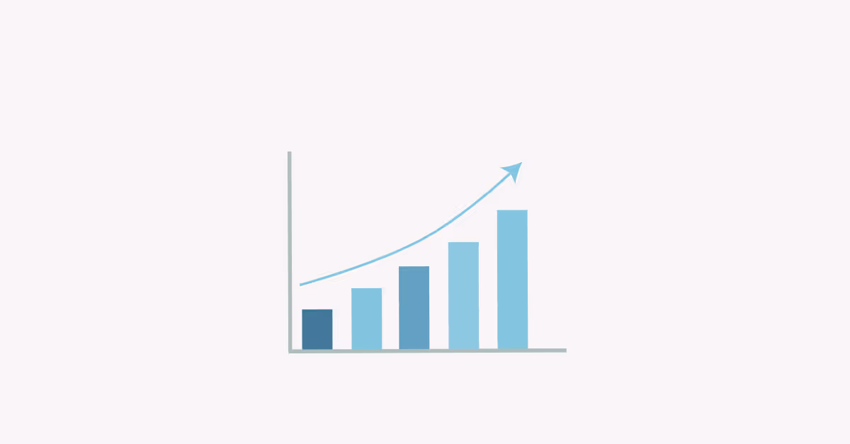
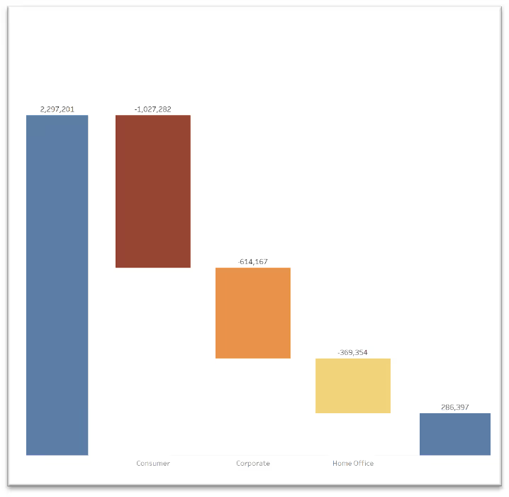
But let's take a step back. What is a waterfall chart? This chart (also known as cascade chart or bridge chart) is a way to visualize how certain dimensions contribute to an overall change. As you can see in the picture below, they kind of resemble a flow (or fall) of water in a waterfall – falling from top to bottom. Or you could say – how a certain value got from top to bottom (or vice versa) and what has contributed to such journey.
That being said (or written), with this kind of chart you will be able to analyse how certain dimensions contribute to the overall change of measures. Let me give you an example from a business context. Suppose you want to see which segment was a main driver of a big difference between forecast (left bar) and a result (right bar).
In this post, I would like to guide you step-by-step through creating a waterfall in Tableau. For simplicity reasons, I am going to use Sample Superstore – data, we are all very well familiar with.
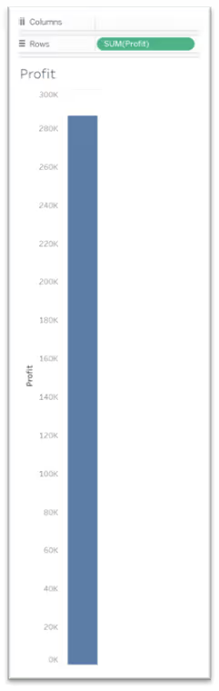
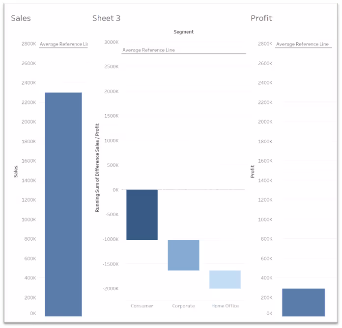
What you are seeing in the picture above are in fact three different sheets, brought to one dashboard. In fact, on the left side you can see Sales and on the right side, you see Profit. However, you can replace these measures with any measures you want to – the logic stays the same. So let's start.
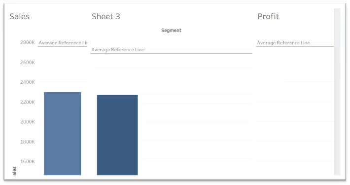
- Create a basic bar chart from your first measure. In this case :
SUM(Sales)

- Repeat the step for your second measure. In our case :
SUM(Profit)
Now the fun part begins.
As mentioned above, we are interested in how certain Dimensions contribute to the overall change. In our case, we are interested, how different segments are driving the difference between Sales and Profit. Also, we know that we will want to filter on Years (Order Date) in the final dashboard (this will be relevant for further calculations :)
- Create a calculated field
Difference Sales/Profit : [Profit] - [Sales]and letss bring it to a view. If you select bar chart, it should look like the picture below.

- Now, let's change the marks to a gant chart and you should see a visualization just like the one below.

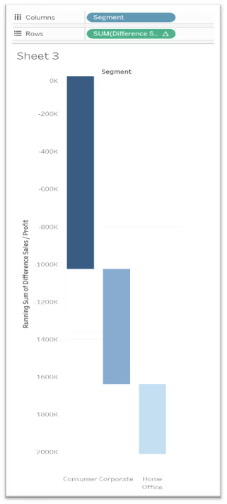
- Now, change the calculation to Running Total.
- We want to visualize the amount, which is contributing to the overall change per segment. Therefore, you need to create a “Negative Difference Sales/Profit”, which is nothing else but - "Difference Sales/Profit”, (see step 3). If everything went right, the result should look like the viz below.
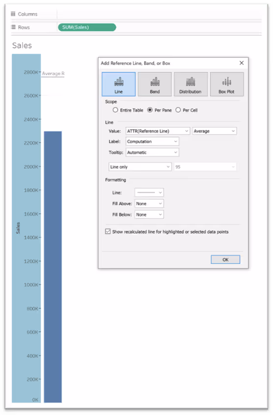
- Let's fix (align the axes.) As you can see, the axes are automatic. This is something we need to fix first. One of the tricks is to bring the same reference line to a view. Now it will get a little bit hacky. Here is the calculations I used

- Now bring this calculated field to a detail and add a reference line to all your views.
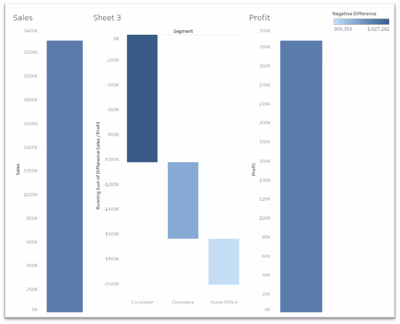
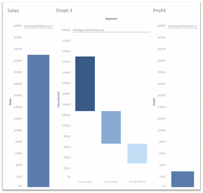
After you have done that, let's have a look at how our dashboard looks like right now. It slowly starts to look like a waterfall chart. However, there are still a few things that need to be fixed.
- We will need to fix the values of the middle viz, which shows the differences. We see that it starts at 0, however, we need it to align with the viz on the left and right side. To fix this, we:
(a.) Need to create a calculated field – I will call it [Fixed Sales], which will fix the total SUM of Sales. We fix it on Year, as this will be the only dimension we want to filter on.
{ FIXED YEAR([Order Date]):SUM([Sales])}
(b.) As a second step, we create a calculated field, which will be an addition of [Fixed Sales] and the Running Sum, which we currently have in the view.
SUM([Fixed Sales]) + RUNNING_SUM(SUM([Difference Sales / Profit]))
Now, replace the calculation in the view with this new calculated field and let's have a look at how the waterfall looks like right now. Well, it starts to look like a waterfall chart. Now, we will need to make some changes to align it and make it look prettier.
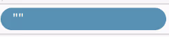
- First of all, let's hide the headers and titles from the visuals. This will help us with the alignment in the top. Next, we need to align the bars at the bottom. You can see that the Zero Line in the left and right bar are positioned much lower than the middle one. As you assume, this is because we do not have any dimension in the view. Therefore, we create a fake one. E.g. just type “” into your columns. This will create a fake dimension (see pic below ) and will push the bars a little bit up. With this, we will be able to align the bars.
- Hover over the Zero axis and drag it to align with the axis of the visualisation in the middle.
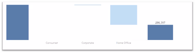
- Now, hide field labels in the visualisation in the middle (Segment). After you will do that, all three lines will be aligned. As one of the last step, hide all three reference lines and their labels (right click on a line, go to edit, set Line to None and Label to none).
- Now, remove the background lines. Right click on the dashboard. Go to Format – Lines – Rows – and set Grid Lines to none. To make it a bit more visually appealing, drag your Negative difference field on colour. Et voilà. Now you have created a nice waterfall chart that is showing you how Segments contribute to the overall change.

Feel free to check out the waterfall chart in action here.


.avif)