

.avif)
Layout containers in Tableau are dashboard objects that group worksheets, filters, legends, and other elements so they stay aligned and resize together. To use them effectively, plan your dashboard layout first, then build it top-down: drop the outermost container first, use placeholder objects (like blank elements) to reserve space, then nest smaller containers inside.
This stops Tableau from creating runaway nested containers — the single biggest cause of dashboard layout frustration.
What are layout containers in Tableau?
Layout containers are dashboard objects in Tableau that group related items — worksheets, filters, legends, text boxes, images — so they can be positioned, resized, and formatted as a single unit. As you change the size or placement of items inside a container, the other items automatically adjust to fit.
Tableau offers two container types — Horizontal and Vertical — and each can be added in either Tiled or Floating mode. That's it.
Just two decisions. But those decisions drive most of the alignment problems users run into when building dashboards.
If your dashboards regularly drift out of alignment when you resize them, contain charts that don't line up cleanly, or behave unpredictably across devices — layout containers are the fix.
Horizontal vs vertical layout containers
The difference comes down to one thing: which dimension Tableau locks for you.
When to use a horizontal container
A horizontal layout container arranges objects side by side in a single row. Every item shares the same height; only the widths vary. Think of books on a bookshelf — they all hit the same ceiling.
Use a horizontal container for:
- A header row with a logo, dashboard title, and "last refreshed" date
- A row of KPI cards (e.g. Total Sales, Total Profit, Average Order Value)
- A worksheet placed next to its colour legend
- Any group of charts that should sit on the same row
When to use a vertical container
A vertical layout container stacks objects on top of each other in a single column. Every item shares the same width; only the heights vary.
Use a vertical container for:
- Filter panels stacked down the right-hand side
- A title sitting above a chart
- The overall outermost container holding multiple horizontal rows
- Anything you want to stack top-to-bottom
A simple rule: horizontal containers control height across their children; vertical containers control width. Pick the one that matches the dimension you want locked for the whole group.
Tiled vs floating containers: which should you use?
Every container, object, and worksheet on a dashboard is either tiled (the default) or floating. The distinction is about how items relate to each other on the canvas.
Tiled containers snap into a structured grid alongside other tiled items. They behave predictably when you resize the dashboard, which is why most experienced Tableau developers build the bulk of their dashboards using a tiled approach.
Floating containers sit on top of other objects at fixed pixel positions. They give you total control over placement, which is useful for overlays, navigation buttons, pop-up panels, or anything you want to layer on top of another chart.
Tableau treats tiled as the default; hold Shift while dragging a container in to make it floating instead.
Recommendation: Build the main structure of your dashboard with tiled containers, and use floating containers selectively for elements like navigation icons, info buttons, or overlays. This combination is widely considered the most maintainable approach to dashboard layout in Tableau.
Why layout containers are worth the effort
Layout containers take a bit of practice, but they pay off in four concrete ways:
- Perfect alignment. When objects share a container, they share a dimension. No more nudging charts pixel-by-pixel to line them up.
- Predictable responsiveness. Containers keep your layout behaving sensibly when users view the dashboard on different screens or in Tableau Cloud.
- Easier formatting. Apply padding, background colours, and borders to the container once — every child inherits the formatting context.
- Faster iteration. Need to swap a chart? Drop the new worksheet into the same container slot and it picks up the existing size and alignment automatically.
The catch: containers reward planning and punish improvisation. Drop sheets onto a blank dashboard at random and Tableau will create a tangled hierarchy of nested containers that's painful to undo. That's why the next two steps matter.
How to use Tableau layout containers
Step 1: Plan Your Dashboard Before You Build
This is the step almost everyone skips, and it's the single biggest reason dashboards become hard to build. Five minutes of planning saves an hour of fighting with the canvas later.
Define your audience and device
Who's going to use this dashboard? Where? On what?
- Audience: Executives reading at a glance? Analysts exploring deeply? Operational users checking once an hour?
- Device: Desktop, tablet, mobile, embedded in another app?
Tableau lets you create device-specific dashboard layouts, but you need to know which devices you're designing for before you start.
Define the purpose and key questions
- What decision should the user make after viewing this dashboard?
- What's the single most important number or chart?
- What questions should they be able to answer without contacting anyone?
If you can answer these three questions in one sentence, the layout starts designing itself.
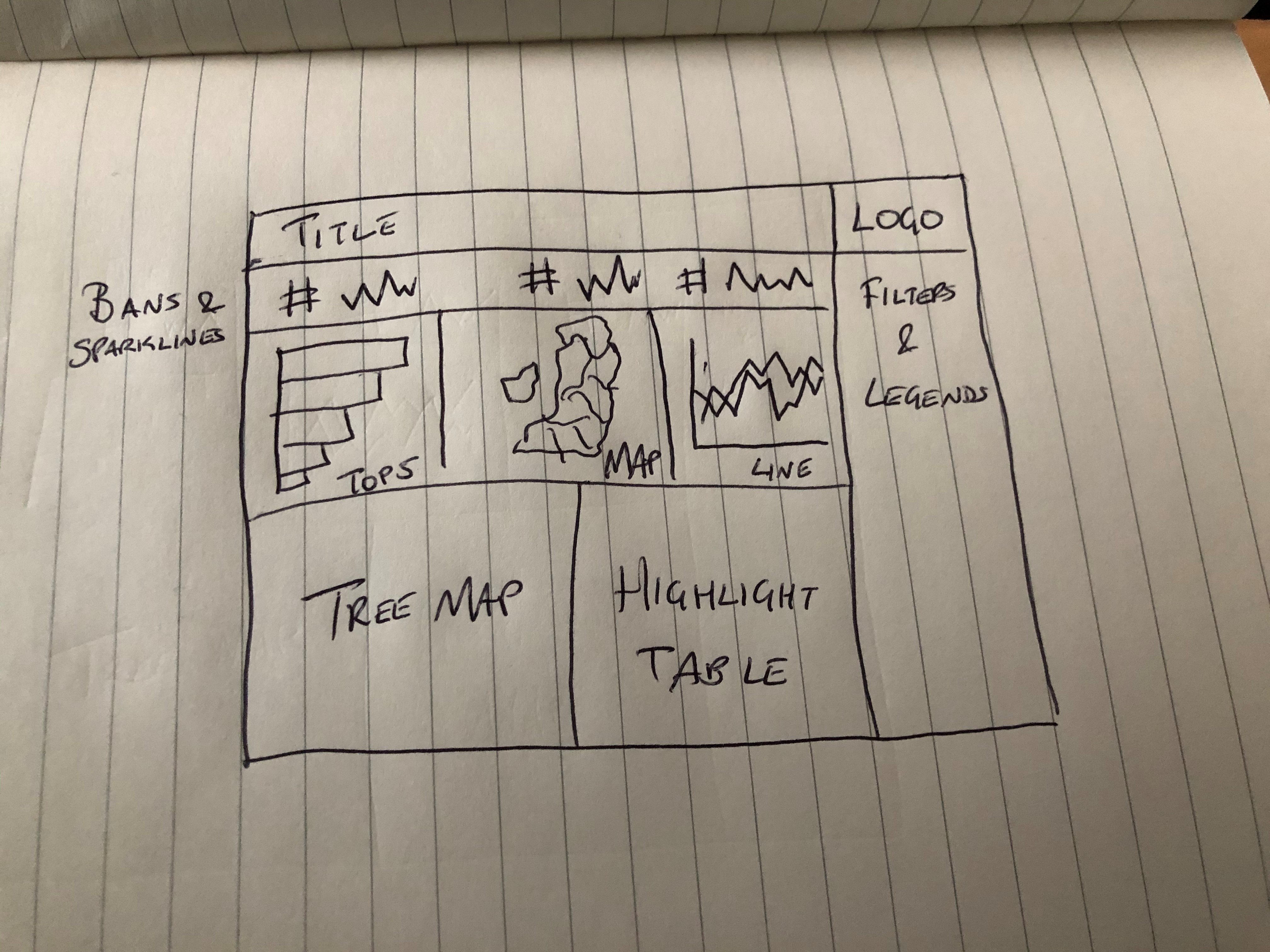
Sketch the layout in zones
Grab a pen and divide the screen into zones. The output doesn't need to look pretty — it just needs to identify how many distinct areas your dashboard has.
A typical four-zone layout might look like this:
- Zone 1: Filters and legends, right-hand column
- Zone 2: KPIs and sparklines, top row
- Zone 3: Primary chart, middle row
- Zone 4: Supporting charts, bottom row
For each zone, decide whether the contents need to sit side-by-side (horizontal container) or stack (vertical container). The whole dashboard usually lives inside one outermost vertical container, with horizontal rows nested inside it.
Step 2: Build Your Dashboard Top-Down With the Placeholder Trick
Here's the technique that makes containers actually behave: build from the outside in, and use placeholder objects to reserve space before nesting child containers.
Tableau's default behaviour when you drop a container inside another container is to fill the entire parent area. That means the next container you add doesn't go next to it — it goes inside it.
That's where the nightmare "container inside a container inside a container" hierarchies come from. Placeholders prevent it.
Here's the workflow:
Start with the outermost container
Identify the largest container in your sketch — usually a vertical container that will hold every row of the dashboard. Drag it onto your blank dashboard. It will fill the entire canvas. Good.
Add placeholder objects to reserve space
Before dropping in any child containers, drag two or three Blank objects (or Text objects) into the outermost container. Label them "Top", "Middle", "Bottom" — whatever maps to your sketched zones. These placeholders force Tableau to divide the parent container into clear, separate slots.
This is the trick. With placeholders in place, every new container you drop in goes between placeholders, not inside them. You stay in control of the hierarchy.
Drop in nested containers and worksheets
Now you can confidently replace each placeholder with its real content:
- Drag a horizontal container directly onto a placeholder. It replaces the placeholder and takes that slot.
- Repeat with the next placeholder and the next container.
- Once your nested container structure is in place, drop your worksheets into each container.
- Add a new round of placeholders inside any nested container before nesting further.
Open the Layout pane (left-hand side) and watch the Item hierarchy as you build. Every time you add an object, check that it landed where you expected. If it didn't, undo immediately — fixing the hierarchy later is much harder than catching the mistake now.
A useful habit: rename containers as you create them (right-click → Rename Item) so "Horizontal Container 4" becomes "KPI Row" in your hierarchy. Future-you will thank you.
Pro tips for working with layout containers
A handful of small habits that separate frustrated container users from confident ones:
- Use blanks for spacing, not extra containers. Need a gap between two charts? Add a Blank object and resize it. Don't nest another container just to create whitespace.
- Adjust padding before adding containers. The Layout pane lets you set inner and outer padding on any object. Most spacing problems can be solved with padding rather than additional structure.
- Copy and paste container structures. Since Tableau 2021.4, you can copy and paste entire container structures using the right-click menu. If you're building a dashboard with repeating tile patterns (like KPI cards), build the template once and duplicate it.
- Colour your containers temporarily. While building, give each container a different background colour. It makes the structure visible at a glance and helps you confirm where new objects will land. Remove the colours once the layout is locked in.
- Pin sizes for fixed elements. Headers, navigation rows, and filter panels usually want fixed pixel heights or widths. Use the Layout pane to set these explicitly so they don't resize when the dashboard is viewed at different sizes.
- Use thin text objects as separator lines. A clean way to add dividing lines between sections — no images needed. Anoop Odedra covered this technique in detail in Tableau Tip: Easy Lines for Separating Dashboard Content
Once your container structure is solid, the polish layer is where dashboards start to feel professional. Custom titles, formatting, and visual hierarchy all build on a clean container foundation; our guide on personalising Tableau dashboards with custom titles and covers the next steps.
Frequently Asked Questions
How do I select a layout container in Tableau?
The easiest way is to open the Layout pane on the left side of the dashboard workspace and click the container's name in the Item hierarchy list. You can also right-click any object inside a container and choose Select Container from the shortcut menu. Clicking directly on the canvas often selects the inner object instead, which is why the Item hierarchy approach is more reliable.
Why do my Tableau containers keep nesting when I don't want them to?
Tableau's default behaviour is to drop new objects inside whatever container is closest to your cursor. To stop this, drop a Blank or Text object as a placeholder inside the parent container first — this divides the space into clear slots so the next container you add lands beside the placeholder rather than inside it. Also, never double-click a worksheet to add it; always drag it in deliberately.
Can I convert a tiled container to a floating one?
Not directly — there's no built-in conversion button. The workaround is to create a new floating container in the desired position, then drag your worksheets and objects from the tiled container into the floating one. Once empty, delete the original tiled container. You can also use the Item hierarchy in Tableau Cloud and Server to reorder both tiled and floating items more flexibly.
How do I delete a layout container without losing my worksheets?
Select the container (use the Item hierarchy for a clean selection), click the dropdown arrow at the top of the container, and choose Remove Container. This removes only the container wrapper. The worksheets and objects inside are released back onto the dashboard and stay intact. The original worksheets in your workbook are never affected.
Conclusion
Layout containers stop being mystifying the moment you switch from "build as you go" to "plan first, then build top-down." Sketch your zones, identify your outermost container, drop placeholders to reserve space, then nest inward. That's the whole technique.
Most dashboard layout pain comes from skipping the planning step or dropping objects randomly and hoping Tableau works it out. It doesn't — but with the placeholder approach, you stay in control of every drop.


