Timothy from Biztory took part in the #IronViz Europe and chose to analyze the data of the Eurovision Song Contest.
In Tableau's most recent Iron Viz cycle (March 2017), the focus was laid on a new capability of Tableau 10.2: the ability to connect to shapefiles.
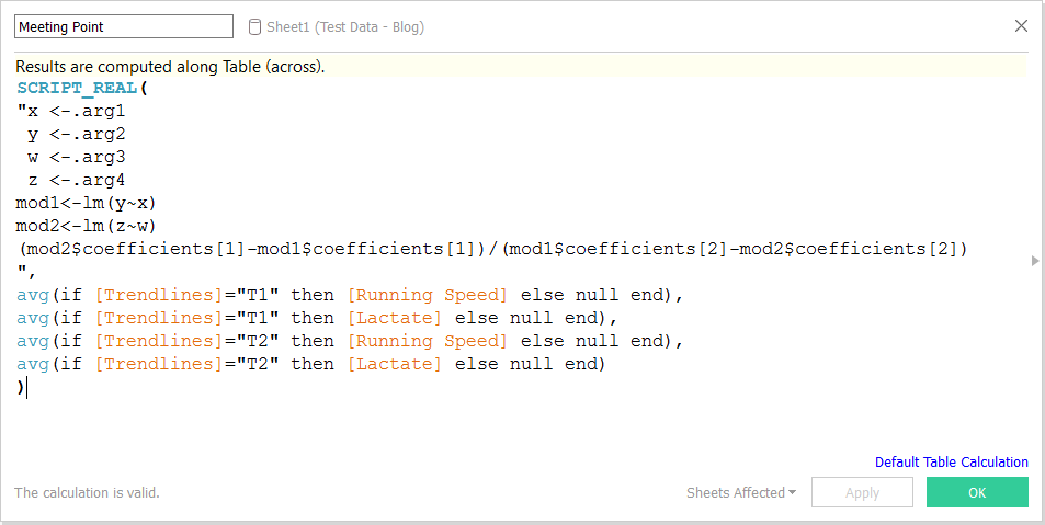
A quick view into how you can calculate slope and intercept with Tableau or Tableau integrated with R and the use cases of these KPIs.
A blog about the versatility of Tableau. Is it possible to use it not only as the best visual analytics tool but also for invoicing?
The story behind the creation of an awesome Chicago Tax Viz, with Tableau and Exasol on 105M records. Part of the Makeover Monday series.
A clever trick with custom color palettes to assign values to data in Tableau Desktop.
In this blog we discover how to plot streets in Tableau using Alteryx.
Find out about the easiest way to add lines as separators for your dashboards' content! Better than adding an image, fiddling with a sheet or what else.
We competed in the Tableau User Group T-shirt contest and we won! This blog post explains all steps and shows you the entire designing process!
Check out this viz of our cycling adventures in the south of Spain!
Create different viewpoints in Tableau by using parameters to filter your filters. This makes sure different kind of users can use the same dashboards!
Using Tableau and some creativity, we take a look at world’s deadliest earthquakes since 1900. Where and when do they occur the most?