Versatile Tableau: Can you use Tableau to create your bank statements? Read this blog post and find out how you can create your bank statement.
Timothy from Biztory took part in the #IronViz Europe and chose to analyze the data of the Eurovision Song Contest.
In Tableau's most recent Iron Viz cycle (March 2017), the focus was laid on a new capability of Tableau 10.2: the ability to connect to shapefiles.
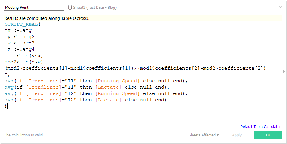
A quick view into how you can calculate slope and intercept with Tableau or Tableau integrated with R and the use cases of these KPIs.
A blog about the versatility of Tableau. Is it possible to use it not only as the best visual analytics tool but also for invoicing?
A clever trick with custom color palettes to assign values to data in Tableau Desktop.
In this blog we discover how to plot streets in Tableau using Alteryx.
In this blog we explain how to make Tableau dashboards look great on all the screen sizes.
Find out about the easiest way to add lines as separators for your dashboards' content! Better than adding an image, fiddling with a sheet or what else.
Check out this viz of our cycling adventures in the south of Spain!
Create different viewpoints in Tableau by using parameters to filter your filters. This makes sure different kind of users can use the same dashboards!
What is a Context filter in Tableau? How does it work and does it affect my visualizations?